OLD POST ALERT! This is an older post and although you might find some useful tips, any technical or publishing information is likely to be out of date. Please click on Start Here on the menu bar above to find links to my most useful articles, videos and podcast. Thanks and happy writing! – Joanna Penn

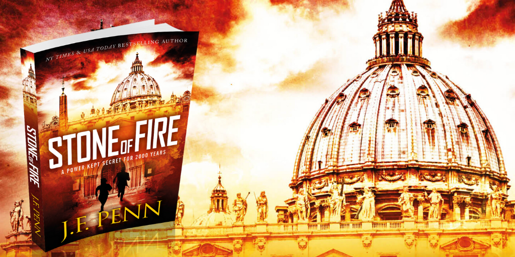
My thriller novel ‘Pentecost' is back from my editor and I am in rewrite mode. I am putting together my marketing plan and am currently just over 3 months away from launch (expected to be Feb 1st 2011). I will soon be putting together the back blurb and letting you read a few chapters, but to start the marketing in earnest I need to get my front cover sorted.

In the last few weeks, I have been working together with Joel Friedlander, The Book Designer who has put together some fantastic options for my book cover.
I have included a number of iterations in this blog post for you to see and also to vote on in the survey at the bottom of the post. I am deliberately holding back detail of the book's plot as I want you to make a decision based on the cover.

Is this a book you would like to read? Does the cover attract you or turn you off? Which cover makes you want to buy the book? (If none of them, do you have any suggestions?) Please add your preferred cover number in the survey at the bottom of the page and any suggestions in the comments of this post.
The process for any kind of design is iterative so it is important to remember when you get the first lot of images that they are not the final options. I sent Joel a draft of the novel so he could get some ideas, and he had a first pass at cover options giving me 9 different covers to comment on. I sent back comments on colors I liked, wording, fonts, images and Joel went round again. We did this several more times and narrowed down the options I specifically liked.

Some of the aspects I particularly wanted to include were:
- Fire and flames, given that the book is called ‘Pentecost' and fire is an overall theme
- The words ‘a novel' or ‘a thriller' as I have noticed that the bestselling books are doing this now
- A cover that is clear when sized as a thumbnail
- My name clearly displayed as I am building a brand. It doesn't matter so much now, but in a few years time it could be more important. One of my favorite authors Matthew Reilly did this when he got started, and now he is huge in the action/adventure/thriller genre.
It's good to have some of these ideas in mind when you work with a designer, but also be open to their thoughts as well since it is their job to come up with new images.
Joel has some more great tips for book cover design here including:
- Establish a principal focus for the cover, and stay with a few images. Don't clutter.
- Avoid white backgrounds and make the text stand out with a title font that is easy to read
- Have a look around at other book covers from novels/books in your genre to see what they are doing
Pentecost was re-edited and re-published as Stone of Fire in 2015.
Hi Joanna
Was a fabulous idea about choosing the cover. I am a designer and have my own business, but I too am writing a book and I love the way to open your doors to us. I have selected Option 1 for the cover it stands out for me and is the best design of them all.
Good luck and well done!
Heather
Hey Joanna,
This is getting exciting! I haven’t read a thriller for years, so I’m really looking forward to this 🙂
I chose No. 1 despite really wanting to pick No. 2 – if the flame on No.2 wasn’t as “thin” as it is, I would have definitely chosen that one. I just felt that the flame on No.2 was … lacking any real emotion that is normally conjured when looking at fire, like you get when looking at No.1. It doesn’t quite have the malevolence or mystery enough yet.
Still, I’ll enjoy it nonetheless!
Thanks Laneth – I hope you will like the book – I’ll be posting chapters before Xmas so you’ll be able to try it out!
Two. An intriguing juxtaposition of sex and religion that grabbed my attention immediately. Congrats!
Hi Joan, I’d be interested in knowing which aspect you thought was ‘sex’ on the cover? Perception is such an interesting topic!
Definitely option 2. I like the contrast and the tension created by the various elements in the design.
Best of luck!
Mike
By email
From @NinaAmir “1 and then 4. ”
From Johanna Baker-Dowdell
“I voted, but just wanted to let you know I preferred option 2, but with the
text/font from option 3.”
I really like number 2.
It has the greatest impact – the column of fire draws the eye upwards and then you see the details of the gothic arches and the ??? church / cathedral as a kind of implied backdrop.
Hope it is a good as the picture – te he he
Hi Vicki – it will be better than the picture 🙂 (if I do say so myself!)
I like option 3 – particularly the font of the Title. I think that having the ‘t’ dropped as a cross like that makes it that bit unique so you can use the jpg of just the title anywhere – it will become like a signature symbol of the book.
I voted option 1 for total visual appeal. I like the font for the title – visually it spells intrigue – I also prefer “A Thriller By” above your name and think that your name stands out really well on this cover as the background is slightly darker but perhaps the colour of your name could be yellow as in option 2 to really make it stand out.
Good luck with the choice.
I voted for Number 3. I think it is the easiest to read. The only suggestion I would have is to make the “A Thriller” text stand out a little more. I couldn’t quite make it out.
Congratulations on the completing the novel!
Option 2, without any doubt. The other three remind me of something else I’m not able to identify exactly – maybe was a book published in Italy. Anyway, they look familiar. Option 2 in my opinion stands out, the geometry of the page is interesting. I’d make only an adjustment, so that the title could stand out a little more. It looks intriguing, I’d buy it.
Thanks Virginio – I think there are some other books with flames on the cover but perhaps a little familiarity is not a bad thing?
I would also like to add I like photoshop image – http://twitpic.com/30yomu – by CA Marshall
Although not too keen on the lettering and will reiterate my favour for option 3 Pentecost font.
My previous comments do not appear. Therefore I shall repeat, I choose option 4 image and really liked the font used for Pentecost title in option 3.
Sorry for the delay in comments appearing Maria. I have taken off approvals for commenting but it still seems a little slow. Thanks so much.
I voted for #1. The second one doesn’t thrill me (no pun intended!) as much as the other three. Compared to the others, it’s a bit anemic. I find the cross in “Pentecost” in #3 distracting (and cliche). I don’t like the black “Pentecost” in #4.
My personal favorite is option 4, but I voted for option 2. Here’s why.
Symbolism. The word Pentacost has a certain religious meaning to it. Some churches use it or a variation of it in their names. To some, it’s a holiday.The menacing fire in option 4 also has a certain religious meaning to it – as in hell – which is something of an opposite to the meaning of Pentacost.
I’m sure there will be some who would take offense at the mixed signals the cover sends. Since I have no clue what is on the pages, the content there could add – or detract – from any religious objections by prospective buyers.
Just sayin’
Thanks Julie. I guess I am intending for some amount of controversy in the style of Dan Brown. I certainly don’t intend to be offensive with anything, but with choosing a religious topic, I am bound to have some detractors (but I hope to have more supporters!)
Thanks!
I voted for 1, with two second. I’d like to see Pentecost be a different color, something red or orangish, like your name. Though you’d have to make sure there’s enough contrast.
For my just published vampire thriller, Blood Justice, http://bylightunseenmedia.com/bj.htm, we went through several tries. The first one I was embarrased to show anyone, the second worked much better.
Good luck.
I voted for #2 because I liked the illustration much better than the others.
#s 1 & 3 I bypassed because the illustration is strange looking…though I do prefer the title design on #3 better than all the others.
Over all I think the best cover would be a combination of the following:
Title Style: #3
Title color: #4 w/ “A Thriller” in white
Illustration: #2
Author Name: #1 I like this color best
Those are my choices. Good luck with the cover design and release.
Hi Joanna, I voted for Option #2, as i felt the elements fit better with the meaning and origin of the word Pentacost. However, I much prefer the lettering for the book title in Option #3, as someone else has said before (I’m not alone, yay!). I love the cross/letter T in that version of the title.
I vote for Option #2. Option one is good, but can’t see behind the flame very well. Other option is to put a ‘little’ more flame on Option #2. I particularly like font title in Option #3, but like your name and the placement of ‘A Thriller By’ in Option #2. Suggestion is to use the title font from Option #3 in Option #2.
I really was pulled to Option 2. If I had to pick a second choice it would be Option 3.
I would read this book and look forward to it. You must be very excited to be getting so close.
Way to go Joanna! You inspire me to keep plugging away.
Thanks Cheryl! I am excited and a book cover certainly makes it tangible. These little steps make the rewrites easier to get down to as I know there are people interested in the book!
Hi Joanna. My first time ever at entering a blog…
I chose the #2 but wondered if the background could be a little darker for the benefit of the appearance in thumb nails. The tongue of flame sits better with my idea of the Pentecostal manifestation. Good luck with the book and design.
David.
Hi David, thanks so much for your first comment ever! I appreciate the effort – many of us bloggers sit here wondering if there is anyone out there! We’ll definitely be looking at reworking #2 considering the amount of feedback! Thanks.