OLD POST ALERT! This is an older post and although you might find some useful tips, any technical or publishing information is likely to be out of date. Please click on Start Here on the menu bar above to find links to my most useful articles, videos and podcast. Thanks and happy writing! – Joanna Penn

My thriller novel ‘Pentecost' is back from my editor and I am in rewrite mode. I am putting together my marketing plan and am currently just over 3 months away from launch (expected to be Feb 1st 2011). I will soon be putting together the back blurb and letting you read a few chapters, but to start the marketing in earnest I need to get my front cover sorted.

In the last few weeks, I have been working together with Joel Friedlander, The Book Designer who has put together some fantastic options for my book cover.
I have included a number of iterations in this blog post for you to see and also to vote on in the survey at the bottom of the post. I am deliberately holding back detail of the book's plot as I want you to make a decision based on the cover.

Is this a book you would like to read? Does the cover attract you or turn you off? Which cover makes you want to buy the book? (If none of them, do you have any suggestions?) Please add your preferred cover number in the survey at the bottom of the page and any suggestions in the comments of this post.
The process for any kind of design is iterative so it is important to remember when you get the first lot of images that they are not the final options. I sent Joel a draft of the novel so he could get some ideas, and he had a first pass at cover options giving me 9 different covers to comment on. I sent back comments on colors I liked, wording, fonts, images and Joel went round again. We did this several more times and narrowed down the options I specifically liked.

Some of the aspects I particularly wanted to include were:
- Fire and flames, given that the book is called ‘Pentecost' and fire is an overall theme
- The words ‘a novel' or ‘a thriller' as I have noticed that the bestselling books are doing this now
- A cover that is clear when sized as a thumbnail
- My name clearly displayed as I am building a brand. It doesn't matter so much now, but in a few years time it could be more important. One of my favorite authors Matthew Reilly did this when he got started, and now he is huge in the action/adventure/thriller genre.
It's good to have some of these ideas in mind when you work with a designer, but also be open to their thoughts as well since it is their job to come up with new images.
Joel has some more great tips for book cover design here including:
- Establish a principal focus for the cover, and stay with a few images. Don't clutter.
- Avoid white backgrounds and make the text stand out with a title font that is easy to read
- Have a look around at other book covers from novels/books in your genre to see what they are doing
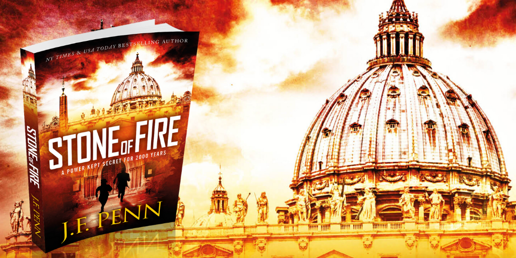
Pentecost was re-edited and re-published as Stone of Fire in 2015.
I’ll be the devil’s advocate and say I don’t see what’s so special with 2.
With that said, it does remind me of the same appeal people have with Apple’s white design so maybe that’s it.
1 and 3 just seems too alike and the way the flames jut out just doesn’t appeal to me.
My pick: CA Marshall’s first twitpic. It’s both great as it is now and at the same time it can be improved to match up with the details of the flames in these other choices. Also I find the font design and black a bit too sharp and dark but the guy probably rushed it a bit.
Not a designer though so I don’t know how to judge these professionally but speaking as a former Christian who is still bothered by the title – only that cover among all the choices would interest me enough to pick up the book.
http://twitpic.com/30yomu
Actual options: #4 – It’s the antithesis of the cover and if the title bothered me before, this was the cover that would most turn down my interest from that perspective but where it gets me is that the flames are brighter. It’s more explosive. Evokes this thought of action thriller.
Definitely not something I would pick up on a bookstore shelf but if it’s been recommended in the web and gets high reviews in Amazon – this is definitely the cover thumbnail that would seal the deal for me among all the default options.
Thanks so much – I’m interested in why the title “bothers” you. I guess I do prefer some kind of emotional response, rather than disinterest. Thanks, Joanna
Oh sorry. I thought you already quoted someone who shared my opinion but then I reread the post and noticed they were mentioning Christian festivals and not being specifically Christian:
“Ann Knudson No matter what the cover, I am not likely to buy a book titled ‘Pentecost,’ since I am not terribly fond of Christian festivals. Not unless somebody I trust recommended it.”
This is mostly the same place I’m coming from except add the fact that I have past experiences and expectations with how the people around me celebrated Pentecost and thriller and flames just doesn’t cross the stereotypical connection I have with that festival.
I’m not saying I had any special spiritual connection to the holiday or sentimental experience but it’s like how TV Tropes mocks the “Santa the Barbarian” cover:
http://tvtropes.org/pmwiki/pmwiki.php/Main/NinetiesAntiHero
There’s just an element there that feels like it’s trying too hard to have a sensational title. Maybe I am mistaken since I’m not well researched with religion and Pentecost does have some connotation with fire but combined with the words thriller and it just seems far fetch over far fetch and just nudges me further and further from being curious about the book.
Hi Jo – these a very tidy designs. Props to Joel – he does super work!
Definitely #2 although distressed text can become a little difficult to read at thumbnail size on the likes of Amazon.
On a personal note, I don’t care for drop shadows on titles although I understand why Joel would use this element to push the text away from the background image.
Anyhow, good work and congrats for having the wisdom to engage a pro to design the most important piece of marketing collateral for your book.
Cheers,
ROBERT
Thanks Robert – I don’t know much about design at all, so these discussions are very interesting!
Gee I wish I could edit the typos in my posts 😉
Joanna, I love your idea to introduce your book, along with getting some feedback!
For a thumbnail, option 2 works best for me – visually as well as (I assume) a glimpse into a setting of your story. Also your name stands out best in option 2.
I think the background is wasted on options 1 and 3 as it is quite hard to make out even when blown up – but I do like the orange behind the white title text. Maybe you could have a little more flame on option 2?
Option 4 comes across as rather generic – not something I would pick up off the shelf.
All the best with the polishing off, printing and release of your thriller!
I initially liked the grey colour in #2, but my final choice was #4.
However, I really like the first one done by Cassandra Marshall, as linked from one of the early blog posts. That’s the best!! I would definitely turn that one over to read the back blurb!
Good luck.
Ian
Hello Joanna,
Thanks for asking my advice on the cover. I choose number 2 because of its uniqueness. I believe it will catch the attention of more readers than the others.
Good Luck
John
The words come through much clearer on option 3. Option 1 is attractive but the title does not jump out at you as much as in #3. If you’re going for brand recognition, your subsequent books could all have the same white, stylized lettering on backgrounds of varying colours.
Hi Sharon, I like the idea of brand recognition for the future – I shall definitely keep that in mind. Thanks.
Joanna,
As an Art Director and designer by day, author by night, I found this exercise interesting. I’m one of the few who voted for Option 3. I think Trisha above outlined the reasons very well. I felt the flame motif is still present. I felt your name popped and would be visible at a small size. Likewise in regards to the book’s title. I’m a proponent of almost logo-izing a book’s title and I think Option 3 best does this. With Option 3, you have your author brand and a sub-brand in the typography of the title that I think is just a little more “custom” than merely a typeface. I also liked the “A Thriller” tag under the title, rather than any extra copy cluttering up your name. In this way, your book cover works the way a resume should (I was always taught that if you look away from a resume and then glance back up at it, the name and phone number should be what immediately pop).
Just a few thoughts.
I’m curious as to what the book is about. That too is a good sign. I think all of Joel’s iterations equally create some mystery about the story.
All the best!
Thanks so much Paul. I really do want to pique people’s interest so it’s great that you are curious. I almost went through this type of exercise with the book title, but when I post the back blurb and sample chapters, you’ll see why the title is ‘Pentecost’.
Thanks, Joanna
From email:
Joanna,
Number 4 is it. No question! I like the flames being more muted (they look more realistic) as opposed to the Title and your name. Knowing that you are brand-focused, your name really pops. The best part, the ‘Thriller’ topper.
I’m having my cover designed as we speak so I’m really immersed in the process. I’ll trade books with you as we come out at the same time.
Keep on pushing,
Cliff
Author and I.T. Project Management Professional
“Lynn’s Story”
“View from Sandhausen – Experiences from
a Foreign Service Assignment” – (Available November, 2010
http://www.linkedin.com/in/clifffeightner
http://www.cfeightner.com
http://flaauthor.wordpress.com/
I actually like Option’s 4 background with the lettering of Option 3 with “A Thriller” ~ Not to further complicate. All the very best to you Joanna!
I voted for 4 because it looks the most thrilling, and I like the clear, bold look. But I don’t often read thrillers anyway. If I were really looking for something to read, number 2 might attract me more because it looks more intriguing and suggests this might not be just a run-of-the-mill thriller. (But then I would look at back cover blurb and have a dip inside.)
I voted for #2, #1 would be my second choice. The “Thriller” on #3 is easy to miss being stuck up at the top in small print. The all flame ones make me think the book may be all violence and gore. The one with the cross makes me think it might be aimed at religious conservatives, but that may just be me because I’m often surrounded by them where I live. I think #2 is easier to absorb and would appeal to a wider audience. I can easily remember the details on #2, but the others will blur in memory as nothing but a bunch of flames.
Thanks Janet – that’s very helpful!
Hi Joanna –
I am HUGE ebook buyer and reader – I use the Kindle app on my phone, and have bought maybe 150? or so Kindle books over the 8-10 months.
That being said, I buy everything through the Kindle Store in the Kindle app, and have an eye for what looks good through my phone. So, I originally read this post on my Droid X, and versions one and two were the only ones that I could read the title on while using my phone. Option3 and 4 were completely unreadable – and I mean the title – not even the words thriller / novel. Cassandra’s text on her samples was much easier to read. Probably due to the thinner lines on it. Anyway, if I see it like that on my large 4inch screen, anyone with smaller screens will have an even harder time.
Just thought I would let you know. 🙂 Best of luck – the designs look really nice now that I am on my laptop at home. But I don’t usually use my laptop when I am looking for a book to buy. 🙂 HTH!
Hi Bianca, that is VERY useful feedback – thanks so much for that. I absolutely want to appeal to Kindle users and ebook buyers so that makes a big difference. I shall also let Joel, my book designer know.
Thanks, Joanna
I chose #4 because the black bold “Pentecost” is strong and fits in the right position below “A Thriller.” The flames look hotter and more powerful than in the other three designs, adding to the feeling of a powerful thriller.
I chose #3 because I like the overall look, but personally I would create a combo of #2, 3, & 4. I like the layout of the text in #2 but the title font of #3. I like the vibrance of the fire in #4 but I think the fire can be dimmed towards the bottom like from #3.
I voted for three because the title font jumped out at me. In my opinion the font for 1 & 2 get’s used ALL THE TIME. I also would have it say “A Thriller” which makes it stand out from “A Novel”.
Number 4 because it’s the clearest. The other fonts are a little too broken and make the title harder to decipher. The flame is easier to see on this version too.
Congrats on the book!
I like two best but would like to see your name in the deeper orange xx
Thanks Mum 🙂 I know that is your first ever blog comment!
Option 1, unless it has a plot with a lot of emphasis on religion – then I would go with Option #3. I might actually prefer #3 with the words ” a thriller”, but since I do not know the plot, that is my two cents for now :). I definitely think the black actually clashes a little, vs blending with the rest of the design. Best of luck to you!!!!
Joanna, I voted for 3, but I also like 4. Both have your name clearly visible as well as the title in an easily readable format. Be happy to host you on my blog when you start your tour. Let me know.