OLD POST ALERT! This is an older post and although you might find some useful tips, any technical or publishing information is likely to be out of date. Please click on Start Here on the menu bar above to find links to my most useful articles, videos and podcast. Thanks and happy writing! – Joanna Penn

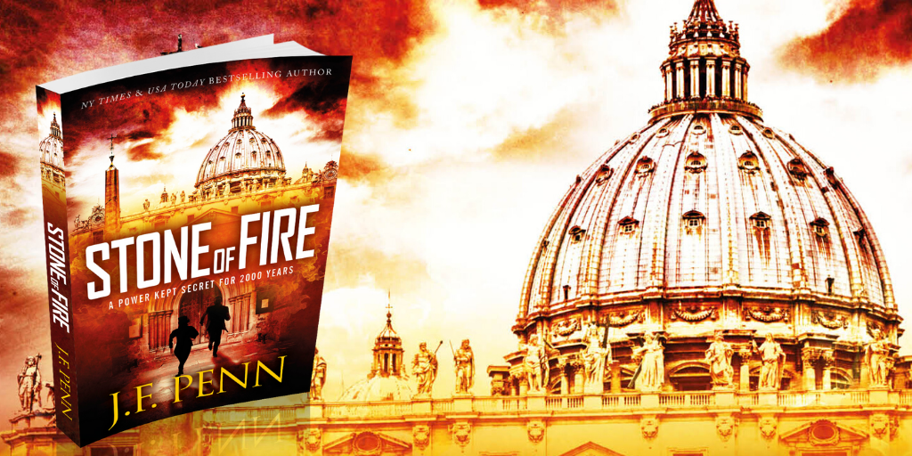
My thriller novel ‘Pentecost' is back from my editor and I am in rewrite mode. I am putting together my marketing plan and am currently just over 3 months away from launch (expected to be Feb 1st 2011). I will soon be putting together the back blurb and letting you read a few chapters, but to start the marketing in earnest I need to get my front cover sorted.

In the last few weeks, I have been working together with Joel Friedlander, The Book Designer who has put together some fantastic options for my book cover.
I have included a number of iterations in this blog post for you to see and also to vote on in the survey at the bottom of the post. I am deliberately holding back detail of the book's plot as I want you to make a decision based on the cover.

Is this a book you would like to read? Does the cover attract you or turn you off? Which cover makes you want to buy the book? (If none of them, do you have any suggestions?) Please add your preferred cover number in the survey at the bottom of the page and any suggestions in the comments of this post.
The process for any kind of design is iterative so it is important to remember when you get the first lot of images that they are not the final options. I sent Joel a draft of the novel so he could get some ideas, and he had a first pass at cover options giving me 9 different covers to comment on. I sent back comments on colors I liked, wording, fonts, images and Joel went round again. We did this several more times and narrowed down the options I specifically liked.

Some of the aspects I particularly wanted to include were:
- Fire and flames, given that the book is called ‘Pentecost' and fire is an overall theme
- The words ‘a novel' or ‘a thriller' as I have noticed that the bestselling books are doing this now
- A cover that is clear when sized as a thumbnail
- My name clearly displayed as I am building a brand. It doesn't matter so much now, but in a few years time it could be more important. One of my favorite authors Matthew Reilly did this when he got started, and now he is huge in the action/adventure/thriller genre.
It's good to have some of these ideas in mind when you work with a designer, but also be open to their thoughts as well since it is their job to come up with new images.
Joel has some more great tips for book cover design here including:
- Establish a principal focus for the cover, and stay with a few images. Don't clutter.
- Avoid white backgrounds and make the text stand out with a title font that is easy to read
- Have a look around at other book covers from novels/books in your genre to see what they are doing
Pentecost was re-edited and re-published as Stone of Fire in 2015.
Hi Joanna, I voted for the book cover with the single lick of flame – even though visually I prefer a different one – because I think it carries suggestion of a tongue. I don’t know if in your book, the religious phenomena of “Tongues” and miraculously understanding different languages plays a part – but the word “pentecost” certainly carries that association for me, as an (ex Baptist, Secular Theology BA graduate!). Visually, there just seems to be a potential in the coincidence of FIRE and TOUNGUES – lick of flame, tongue of fire, firey tongue – maybe not, but thought it might interest you.
Dying to read about your response to your editor.
Regards
Dawn Rose
Thanks Dawn, I am also a Theology graduate and it really informs my writing. The “tongues” idea was not on purpose on the cover, I think it is more of a pillar of fire! But great that you saw that connotation. Thanks.
I like the font style in the title of #1 and #2 as it is edgy yet strong. But between the two, I like #2 better as it has the architectural element which makes the overall feel more compelling to me. #1 is my second choice. The cross in #3 is off-putting to me as if I saw it in a bookstore it would make me wonder if this is an effort at proselytizing, although I understand it is directly relevant to your title and makes sense. #4 I thought was too simplistic and a bit dull.
For my favorite, #2, my only suggestion is that you flare out the flame toward the bottom to slightly wider than your name, which would better highlight your name and make the cover more colorful and eye-catching as well.
Hope this helps…. Good luck!
I chose #3 because it seemed to meet your standards. Your name and the title show up the best, thought I can’t read the THRILLER on any of them. I also like the use of the cross in the word Pentecost in #3. My second choice is #4 because it is really On Fire and the words all show up well. My least favorite is #2 as it looks bloody.
Number 3 seems less cluttered than the rest. It captures my eye best. The lettering should be a bit more prominent. I like the cross in #3 and I’m sure there are many folks who find it off-putting. You can’t please everyone!
Hi Ruth, this post and all the comments certainly prove you can’t please everyone! I think it is up to writers to write what they love, and are enthusiastic about and then see who it attracts! Thanks.
I think the 2nd stands out the most, and has the most detail. If I was going into a book store, lets say Waterstone’s for example. Out of those four I would definitely pick up the 2nd one first. My next choice would be the 1st one. In my honest opinion I think 3 and 4 are a little bland. But that might just be me.
Can’t wait to buy the novel Joanna.
I chose #3 as I thougth the title stood out better than the others and I liked the subtle inference of a cross formed by the “T” in the title. It was a toss up with # 4 which I think is the most dramatic, it was just that the black font didn’t stand out as well.
I like 4. Your name stands out and from the thumbnail cover the image looks clearer and cleaner. Is that a animal face with curved horns looking back from the flames? It is under “e” and “n”.
The information given about the Kindle is helpful. Technology like that is the way of the future for writers.
The very best of luck with your venture. I have two of your other books and find them very helpful. So were your emails with their advice. Thank you.
I have a vision impairment at the moment (temporary hopefully), and found 2 & 4 a little more difficult to see.
2 was light on light and with 4 it was the dark words on a busy background. Loved 1 and 3. Could see both, only chose 1 because I preferred the typeface. Can always use Jaws or connect out loud to read them to me if I can’t see them though. Good luck!
I really like option two with the Pentacost typeface of option 3.
Congratulations, how exciting for you. Also I am with your mum, a darker orange for your name.
Option 2 is my preferred novel cover as it is clean and simple. The central image of the flame stands out, drawing the eye in.
It has that ‘thriller’ feel in the visual style.
I like 3 the best, but with the title in the colour of 1. On my monitor I can’t read ‘a thriller’ or ‘a novel’ on any of them. I like 4 the least because the title text is badly spaced and lacks style in my opinion. I agree with another commenter that the font style in 1 and 2 is overused.
It should be noted, however, that nobody buys a book because of the cover. The cover merely attracts them. Typically, a bookbyer picks up the book because of the title or because they like the cover, then they turn to the blurb on the back … that’s what entices them to look inside. So that blurb is what sells. Once they look inside they decide, by reading bits, whether this is a book they must have.
Hi Carmel – thanks for your opinion as I know you design books! I do want the cover to be a flag to say “look at me”, and then I want people to download the sample (on Kindle/ereaders anyway). I have to sort out the blurb next!
Oops … I meant with the author’s name in the colour of 1.
I liked 4 because I consider it easier to pick from a distance – my eyesight is not perfect. On the other hand, the black in the title looks not quite right. Perhaps a deep purple, since Pentecost has that religious overtone. Definitely keep the author name clear and clean, it really is the most important thing on a cover.
I picked #2 because it was the most visually interesting. The dividing line of the fire draws your eye in better than the uniform background of fire. Indeed that is what the other covers feel like to me – background – with no visual design. I have seen books with plain, un-altered photo covers like that – I haven’t bought them. To me they look a little amateurish.
If I could I would pick the image from #2 and the text/typograpgy from #3. The issue raised about the light text on the light background could be addressed by swapping the name and title so the title is over the darker section at the bottom.
Good luck!
Hi Joanna
Love number 2 – for me it’s clean and precise and also very eye catching. It stands out – it’s more unusual and distinctive than the others.
2nd choice would be number 4 – lots of energy.
Options 3 & 4 I almost missed ‘A Thriller’ but I saw the words on 1 &3 clearly.
Option 3 because my eyes were immediately drawn to the way the “t” in the middle of the word “Pentecost” resembled a cross. This immediately placed an idea in my mind of what the book is about (whether that idea is correct or not, I don’t know at this stage, but it was an immediate reaction). Also the flames lend themselves to seeing images of faces, which I couldn’t see in the other options.
Hi Karen – and also Sue below – the font with the cross is proving very interesting as people have various reactions. I want to provoke some kind of response, not just boredom – but I don’t want people to think it is a Christian book. It is a thriller based on the Christian story of Pentecost – in the same way Dan Brown’s themes are related to Christianity. I hope that comes across in the blurb – which is proving harder to write than the book! Thanks ladies.
Joanna,
Fabulous idea to put it out to the world. I grabbed any person who’d listen when I was trying to choose a cover. I’m so glad I did, because the one I wanted would have been wrong!
I love book cover #1. It says everything I think you’re trying to convey. Love the title art, everything!
Cover #2 has the “tongues of fire” look that I think many non-religious people wouldn’t get. Cover #3 has a Christian cross in the title which may turn off Christian readers and/or may confuse readers as to the intent or content of the book. Cover #4 looks simply boring. In my humble opinion, it looks self-published.
Good luck!
Sue
(@SueInge on twitter)
Hi Joanna,
Looking to your publishing, I choose 4 and also asked husband his independant view and he choose 4 too. It is more appealing, it invites you to pick it up and look at it and I sure with your bio you will then have the buyer/reader hooked. Good luck!
I liked them all Joanna! I voted for #3 because of the cross in the title (lots of recovering Catholic out there, and the “going up in flames” theme is very popular these days). I also like the clarity of the text, including your name. I work at an independent bookstore so I’m familiar with covers that leap off the page. That said, it’s important for the book to appear clear on e-books readers too. But I’m less knowledgeable about that.
Either way, it’s a great job!
Thanks David. I like the thought of appealing to recovering Catholics!
Hi Joanna,
I prefer the cover art and typeface of cover 2. The contrast between the flame and the background is eye-catching and is more suggestive of a thriller to me than the others. I’m a little color vision deficient, so covers 1 and 3 look a little vague too me. There is something behind or within the flame, but I can’t make out what. Cover 4, I think, would be more appropriate for a horror story.
Good luck!
Cam