OLD POST ALERT! This is an older post and although you might find some useful tips, any technical or publishing information is likely to be out of date. Please click on Start Here on the menu bar above to find links to my most useful articles, videos and podcast. Thanks and happy writing! – Joanna Penn
One of the main reasons for self-publishing is creative freedom and control.
 Many of us regularly update book blurb/descriptions, as well as changing categories and keywords. I've also blogged before about making sure non-fiction book titles are based on keyword research.
Today I'm talking about changing book covers because within a few hours, you can completely change the look and emotional impact of your book. When authors like Polly Courtney have resigned over the cover branding for their books, this seems like the ultimate indie freedom.
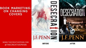
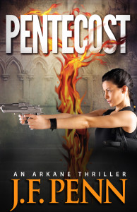
 I published Desecration, a crime thriller, in Nov 2013, and after it debuted on the bestseller list alongside Michael Connelly, it pretty much sank down the charts. I haven't done any further promotion, and it hasn't sold as well as my other books.
It gets brilliant reviews, so once people read it, they love it. But not enough people were trying it … sure, I haven't done any specific promotion, but based on my other book sales, it should be doing better.
The ‘aha' moment
Russell Blake, the author who has sold over 400,000 thrillers and now writes with Clive Cussler, wrote a post in Feb 2014 about tweaking his covers. Russell changes covers in order to “find one that resonates with my readership – as expressed in increased sales.”
He changed the cover on one specific book, Fatal Exchange, four times before settling on the latest iteration – which moved from a theme based to a person based cover.
 HM Ward is probably the most successful indie author right now, with over 4 million books sold and 11 NY Times bestsellers in 2013. She wrote this post about changing her book covers – from arty to genre obvious – and says that:
“COVERS ARE STOP SIGNS. They should quickly reveal as much info about your book to the reader as possible and this did not. As soon as I changed the covers to the current version, sales shot up … Short version: I was really stupid. Don’t wait 9 months to change covers or descriptions on books that aren’t preforming.”
These two fantastic indie authors provided me with an ‘aha' moment, and this is what I decided.
My mistake #1: Theme over character
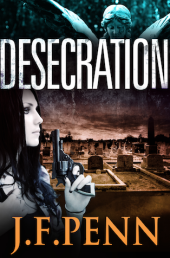
I always have a strong theme in my books, and for Desecration the main theme is anatomy and whether the physical body actually defines who we really are. Yes, this is a deep and meaningful topic and I explore the use of the physical body in life through tattoos, body modification and alternative nightclub Torture Garden. I also write about the use of the body after death in medical specimens and corpse art.
But mainly it's a murder mystery with a British detective, Jamie Brooke, whose daughter is dying. Jamie will do anything to protect her daughter in life … and in death.
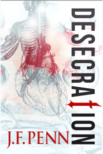 In the initial brief to my [wonderful] designer, Derek Murphy of Creativindie, I had only given him the themes. I didn't even mention the characters. So the first cover, through all initial iterations, was about the medical specimens and anatomy. It's gorgeous, but it has no emotional resonance through character.
For the second cover, the brief was: grieving mother who will do anything to avenge the wrong done to her daughter, and to bring justice to the murder victim. It was all about character.
My mistake #2: Not meeting genre expectations
Desecration is a crime thriller, with an edge of horror in parts. It's certainly not for the squeamish. It has a dark tone and a 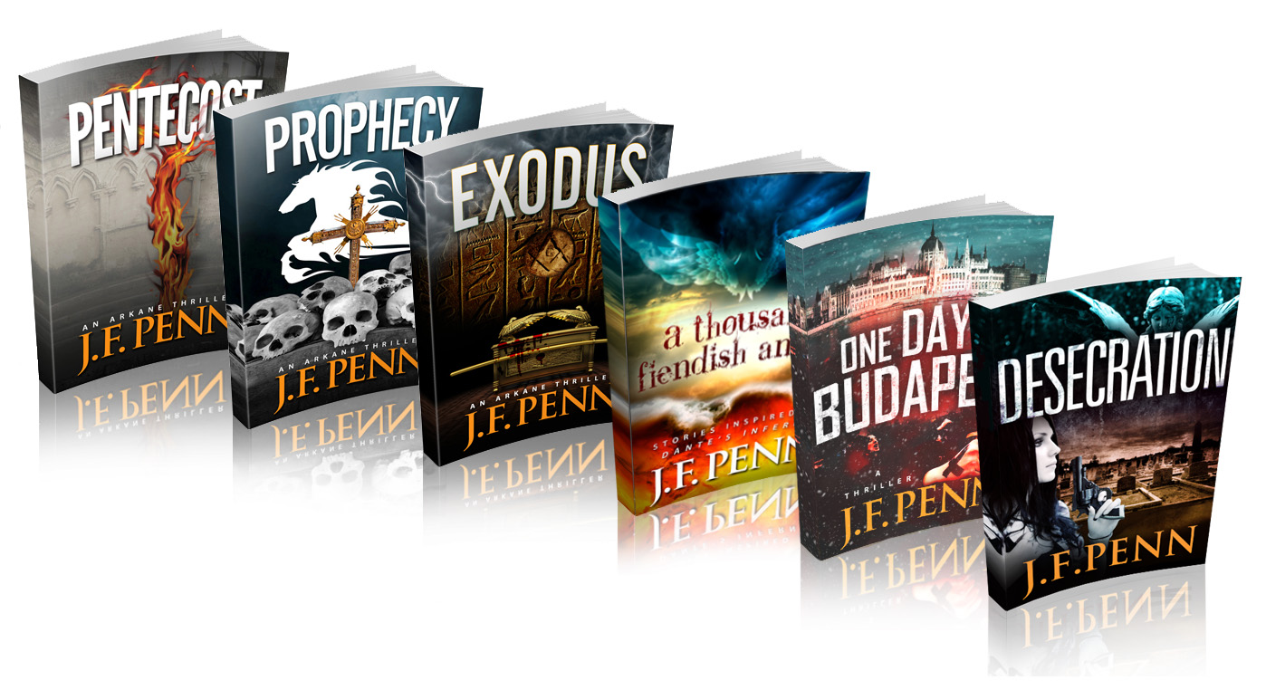 dark theme. The white cover has therefore confused readers of this type of book. White just isn't very dark 🙂
People have also said the original cover looks very arty, very literary fiction. The font down the side is beautiful but not easily readable and the word ‘Desecration' is difficult for some anyway. It's the HM Ward mistake – falling in love with the art, and not thinking of the reader expectation first.
The white cover also didn't really fit with my other J.F.Penn books which are all dark. The new image of all my books together looks a lot better with another dark book in the frame, as above right.
Comments from Derek Murphy, my cover designer
 I asked Derek for a quote for this article, since he did both rounds. Here's what he said.
“We tried a lot of ideas with the first round for Desecration, using mostly symbolic elements. Joanna previously had been adverse to using people on covers so we kept things simple; the final cover she chose is interesting and unique – but wasn't selling well. Here are some reasons why:
1. No emotional connection. Emotion is mostly a matter of scene, color and contrast, although adding characters can help a lot as well.
2. People usually sell covers. Even if a little cliche or overused, stock photo models seem to increase sales.
3. No genre identification. Symbolic covers are better for non-fiction. The stern white, while clinically suitable, probably seemed too much like a non-fiction book. At the very least it was unclear what the book was about – this could have been improved with a tagline.
4. No depth. Adding a scene lets readers know more about the setting and feels more like they can ‘walk into' the story. It's tough to pull off a flat, symbolic cover (even though major bestsellers seem to use them, like the Game or Thrones series, Twilight, Shades of Gray, etc.)
 The new cover fixes most of these issues. It's not a matter of what “looks better” or what people will like – the cover's job is to let readers know what the book is about and whether they might be interested in a single, 1 second glance. If the cover isn't doing this, there's a good chance they aren't going to take a closer look or read the summary or reviews.”
You can find Derek at Creativindie Book Covers, and he also has this great post about DIY Covers in MS Word, as well as a fantastic program to help authors with book cover design. You can find more cover designers here.
The new cover
I am really happy with the new cover!
I spent over 5 hours trawling through all the image sites looking for my idea of Jamie Brooke, the main character. This model totally fits the bill. Of course, British police detectives don't carry guns, but I decided a little artistic license would suit the American audience more 🙂
I've also just uploaded the new print covers to Createspace, so if you have one of the older cover print books, it is officially a limited edition!
In terms of results, it's difficult to say yet. The ranking on the Amazon.com store has moved from ~200,000 to ~50,000, but I have also been involved in other promotions this month. It will be best to wait a few months and see how the average sales are over time.
Tweaking my other covers
 Since my other book covers have also been theme-driven, and I had a BookBub promo coming up a few weeks ago, we decided to change Pentecost as well to add a female character. We didn't want to change the rest of the cover in an attempt to see whether the addition of a woman would make a difference.
I also searched hard for this model, who fits incredibly well since my Dr Morgan Sierra is closely modeled on Lara Croft!
Although it's hard to do any kind of split testing when you only have one book, I have now had two free runs on BookBub for Pentecost.
The first run resulted in ~20,000 free downloads. This latest run with the new cover resulted in over 30,000 downloads. I can't directly attribute it to the addition of the female figure, but at least it shows that the cover change wasn't detrimental, and could mean it was a positive move. Pentecost is still free on all stores if you fancy trying it.
OK, I would love to hear what you think. Firstly, what do you think of my cover change? Do you think the new covers are more effective? Also, have you changed your own covers and has this impacted sales? Please leave a comment below.
When I first saw the original Desecration cover, I’ll admit I was rather jealous, because it’s gorgeous. That said, it did put me off buying it 🙂 The new cover looks more like what I’d like to read.
I prefer the original Pentecost cover, the woman looks a little “pasted on”. I’m not sure I’d think that if I hadn’t seen the original, though.
Thanks Russ – I still think the original is gorgeous too 🙂 but the new one is more representative of the book.
Interestingly, my German translator wants to keep the original Pentecost without the woman on. I wish we could have different covers for different markets as well – like trad pub. I suppose we could by uploading the same edition and selecting different rights …. hmmm, will think about that
Very interesting. I am absolutely your target audience with Desecration, but with the new cover and without knowing you, I wouldn’t have given it a second look. The original cover, on the other hand, basically screams at me “Silent Witness” (the credit sequence) and I would have clicked on even if I hadn’t known the author.
On the other hand, I do se the point about the white not quite working – I think the old design could have worked on a dark background. The best covers in this field by a country mile are the ones for Thomas Harris’ Lecter quadrilogy, and they have very “symbolic” imagery with a strong feel and dark colours running through.
Also agree with Russell about the figures – they don’t work for me – they take the darkness out of the covers (in a way that is way more likely to confuse readers about the horror content than the original cover. I would see the point if this kind of figure were a stock requirement for covers in this area, but I’m not sure it is? I think it works better on Pentecost, which is an action thriller where it will help if people identify with the main character (though showing the face is a controversial thing to do, raising all the questions about people preferring to use their imagination – the very best covers I’ve seen with characters on that are anywhere near the genre are Lee Child’s, and Reacher always stays mysterious – I can’t recall too many in the Dan Brown/Michael Cordy genre that have figures at all?), but really not sure about Desecration. Will be very interesting to see how the reviews come in with the new cover, whether people are more or less surprised at the content.
Anyway, apologies for rambling!
Hi Dan – we can’t compare unknown authors with luminaries like Lee Child and Dan Brown, Michael Connelly etc – since their books will sell even with a plain cover!
I agree on the face thing – it’s why I was so resistant before – but you know I am more interested in playing with commercial aspects than how I FEEL about things. It’s a tough one, but I want to play with it for a while and see what works. The US market is still our biggest income, and although I think the original may be more European, I’m aiming for a broader US reach right now.
Playing is definitely worthwhile – and absolutely, if you’re looking to the US this may be much more the thing (I love that Waterstones now has such a large US import section – it gives a real insight into the different cover tastes – Murakami covers, for example, are unrecognisable as being by the same author in the US and UK)
… we can’t compare unknown authors with luminaries like Lee Child and …
I completely agree with this. I have a copy of Red Phoenix by Larry Bond, which features a T-72 tank with a rifled gun. It’s a techno-thriller, and so I expect (accurate) technical detail in the story. If I didn’t know Larry Bond, I wouldn’t have bought the book (the T-72 has a smooth-bore gun, not rifled). I bought the book despite the cover, because the name carried a lot of weight with me. If your not as well known, the cover image will have more relative weight.
There’s a novella called 1000 Yards by Mark Dawson. It’s constantly showing up in the promotional newsletters. It’s an assassin-thriller. I see it a lot but I’m unlikely ever to buy it. Why? The title implies a long-distance sniper. The cover does indeed show us a man with a gun ready to shoot.
Unfortunately, it’s a handgun.
Unless this is a techno-thriller about a new form of pistol that can drop a man from more than 100 yards (it’s not), that’s a complete fail. The problem is that I wince every time I see it, from the apparent lack of good judgment of the author. Makes me automatically distrust his writing, even without trying it.
Hard to buy a thriller when you laugh at loud at the lameness of the cover. So being in-genre isn’t the only thing to worry about.
Experts in weaponry are definitely the hardest to please! I did just look at that cover and actually I quite like it, but you’re right in that it’s clearly not a sniper weapon 🙂 Getting great reviews though and as a permafree book, it’s doing well. I’m actually getting the sample since it is a UK James Bond style fast read! It’s here if anyone else wants to take a look: http://www.amazon.com/dp/B00DUFCJ10/
The point of the cover is to make you look further. That 1000 Yards cover makes potential readers reject the work our of hand on the grounds of incompetence in the subject matter.
I wish the author well, and all that, but we’re talking about effective covers here…
Hi Joanna,
I just can say that you are right about the Covers. But one point Nov 2014 is future not past 😉 – Have to smile, because it happend to me too in a Blogpost.
Thanks for your interesting Posts
Kerstin
Thanks Kerstin – I have updated that 🙂
Yes – I love the new cover and agree with your decisions why. At one point it was considered wrong to change up covers but now it’s almost par for the course. 🙂
I’ve read a few articles on this topic lately, and I think you made the right choice in changing your Desecration cover. While the first cover is beautiful, I’d definitely buy a book with the second cover long before I’d buy a book with the first.
With that said, I’m torn on the idea of having people on covers, at least in certain genres. Your Desecration cover would still be great without the woman and I feel she actually stands out a bit too much, meaning her pale skin against the dark background seems like a bit too much contrast. I feel similarly about the Pentecost cover, in that I don’t feel the woman fits with the feeling I get from the background elements.
Those are just my thoughts though. In the end it’s up to the author to decide what they want, and if those covers produce better results for you and you like them, then why not use them!
This article is causing me almost as much anxiety as my son’s spelling bee tonight! I’m currently running a design contest for my first book cover and am choosing between artsy, iconic/symbolic, and “stock model”. I’ve been leaning toward the symbolic, but now you’re making me second guess myself.
My meager 2 cents: the old cover of Desecration is beautiful, but I immediately think of a Michael Crichton style medical thriller. The new one says “Detective thriller with grave robbers”.
As a reader, I’m not a fan of models on covers because they never match my mental image of the characters. In general, though, correct genre probably has to come first.
Now I have to go neck to agonizing about my own cover. Thanks for the food for thought!
Sorry to give you angst Gary 🙂 So you feel better, I am still agonizing over this even as we are discussing it here! I love the old over, and I personally like the theme style cover more than the stock model cover BUT/ evidence seems to point to people and genre specific covers being better for sales. I trust HM Ward and Russell Blake more than my own emotion 🙂 BUT/ remember, you can always pick two and change them over later 🙂
Very nice post, Joanna, thanks for sharing the telling details of cover designs. I too tend to get lost in my head when designing things and forget to make sure the obvious (“It’s a crime thriller!!”) is obvious first.
The first cover is gorgeous but it doesn’t fit you. Killing your darlings doesn’t always refer to the words, I’m afraid. However, I’m also not sure comparing the two will provide an answer regarding character or theme based. This is not a series, so the woman on the cover doesn’t have any meaning to the readers. The main difference is the light vs dark theme. The dark theme in general fits the genre better. I think a better comparison would be a similar first cover with the dark theme. I am intrigued on how a change in covers affects sales. I’ve struggled with covers as well and deep down hope that the decision you eventually make won’t have a significance impact on sales. This is certainly a topic worth exploring further.
Hi David- this is actually the first in a new series – so when Delirium is out, the woman might make more sense. I’m also fascinated in how covers affect sales, I think they are so critical and am stunned when people just use basic covers with no effort. Unfortunately, it is very hard to split test unless the testing is done on Google Adwords or Facebook – as Tim Ferriss did with The Four Hour Work Week years ago.
New covers both look great. I was thinking especially with Pentecost, the original cover, without reading any blurbs or reviews, gave me the impression of a strictly religious genre book, probably set in biblical times. The new cover certainly destroys that assumption. I don’t read a lot of thrillers myself, but I can’t imagine that this new version of the cover wouldn’t attract a lot more attention from people who do. Same with the new Desecration cover, for different reasons of course. Both of them now seem to clearly say, “If this is the kind of book you are looking for, here it is!” I really look forward to a follow up in a couple of months on your sales results. I’m hoping/expecting great things for you from this.
Thanks David – and I am definitely keen to make it clear it’s not a religious book, but equally want it to be attractive to fans of Dan Brown 🙂 I’m glad you think the change is effective, and I will report back with sales results later this year. Of course, we can never be sure, since so many factors go into discoverability.
Interesting. I think the new cover for Desecration probably works to get more thriller / horror readers in than the first one – but you were a lot more thoughtful in this book, with some pretty heavy themes, and I wonder if that’s what pushed you towards the first cover in the first instance. You’ll have to have a similar character on the front of the others, though, and I’m not sure I like the gun, given that the heroine doesn’t use one, does she?
I changed my covers when I had a professional design done for my second one and made the first match that. As a non-fiction writer, I think it’s important for me to have a consistent cover theme, which I certainly have – so I hope I’ve made the right decision there!
You’re right on the gun Liz, but the impression is there, so I think it’s OK – it’s gives action to her presence, rather than just a staring face. You’re also right on the heavy stuff. I was so ingrained in the themes of the book, that I lost sight of the reader perspective. Judging covers while deep in edits is probably a bad idea!
Fair enough – and having the graves on it is a good signal about some of the content in the book, which in my mind is a good thing and helps the reader to decide what to do. I’ll be interested to see how your sales go with this new cover, although it’s always almost impossible to quantify these things, isn’t it. Nice to see that you’re getting some good reviews and how they’re giving a good representation of the contents without giving the plot away!
I would definitely agree with the color choice; the white background is great if you’re dealing with a medical thriller, but not so good otherwise.
Now, I’m probably picking at nits overmuch here, but I’m wondering if having your protagonist holding a revolver is the best choice. Because revolvers are mostly target weapons these days, it doesn’t really say, ‘desperate and willing to do anything’ as much as a regular semiautomatic would. And yes, weapons folks tend to be harder to please, but still….
The new Pentecost cover seems to me much more ‘will to do anything to protect’. It shows the protagonist with not one, but two Desert Eagle handguns. Considering that firing one of those is sufficient to sprain your wrist with recoil, the image says: ‘You don’t want to mess with this lady!’ OK, yes, I’m picking at nits…. I love Derek’s comment about ‘walking into’ the story. Very important insight, that!
I’d love to see a follow-up on how the book fairs under the new covers! Good stuff!
Thanks Yael, and you would know about the weapons 🙂 I’m glad you like the Desert Eagles on Morgan! I didn’t have a choice on gun as there was only one stock photo of this model. I like the idea of having my own photography sessions at some point, which is what HM Ward does for her covers. It means you will always be original – but of course, that is also expensive.
Well, you could probably photoshop a different weapon into the stock model’s hands. Not sure if that violates some agreement with the stock photo outfit though. Having your own photo-shoot would be really cool! You could always do a whole bunch of action poses for later use, then photoshop whatever weapons, gadgets or whatever into your model’s hands. Do them on a blue background and…. Oy! You’re making me want to get back into designing book covers now when I’m supposed to be writing! 😉
I totally want to do that photoshoot – maybe in Israel with you!
Hey, I’m up for it! I even have in mind a model or two. It would be fun photoshopping backgrounds in as well. No lack of weird and wonderful scenery around here (I have a friend who gives rooftop tours of Jerusalem’s old city on full moon nights. Now that would make for an eerie background!)
Sorry, I don’t agree that “revolvers are mostly target weapons.” If you’re caught up in current mil/police recommendations, you can always think of it as her backup gun.
Well, it wouldn’t be my first choice as a backup weapon either, but that might just be my own bias. I tend to like something a bit sleeker and lower profile for that (and with higher capacity). Gotta admit though that nothing beats a revolver for accuracy. Not to mention that it looks very classy on a book cover!
I’m so thrilled to know that stock models help move books. It’s definitely what my eye is drawn to, and what I’ve integrated into my book covers thus far. I figure my audience is much the same as I am in what they like to look at. That said, I LOVED your previous cover (very artistic!), but I do see the need to personalize it more and Derek’s comment about possibly tagging the genre/series title made sense.
I’m working on a mystery cover now and I’m pondering if including the series title will clutter the cover or not. Series titles are listed on Amazon and elsewhere…as well as genre, so when readers see your book there, it’s obvious what it is. But because we are using stock art, it’s not your typical mystery cover (which tends to be words and a scene or one object). Trying to convey the vibe through the picture itself and the words.
Great job on cover art and all the best on the new look! And BTW–the Lara Croft thing catches my eye, for sure. Just about ready to beat Tomb Raider: Anniversary, any day now.
Thanks Heather, and we definitely have to keep in mind that our books will never appeal to everyone, they should appeal to those people who might appreciate the kind of text within. Sounds like you’re my kind of gal 🙂 all the best with your covers.
The new covers are NOT APPEALING to me at all. They look hackneyed and make me presume the same about the writing. I spend $200/mo on books. But never on books that look like this.
As above Katherine, our books will never appeal to everyone. They should turn off as many people as they turn on – and it’s important to turn on the ones you want to attract as readers.
The elements on a book cover are symbolic of what will be in the book. Stock images=stock characters. That is not always the case, of course. But that is what the symbolism will tell readers. Some readers don’t like stock characters.
That’s kind of confusing since stock models are used on most covers with people – we wouldn’t use pics of ourselves or our families? Unless you do your own photoshoot with people you know, the photos would always be ‘stock,’ wouldn’t they? Even without people, everyone uses stock so I’m not sure what you mean by this. Do you use other sources of photography?
I mean exactly what I said. All stock images look like what thet are–they are instantly recognizable as false (as in, purchased from a database of images, not unique, not created for the book, etc). They tell the reader the book will not be art. The book will fit a formula w/ stock characters. To some people, that is reassurance that the book will be exactly what they want it to be. To others, no so much. I’ve purchased books with stock images. Most of the time, the stories are full of stock characters. Recently, I purchased one from an author I know from social media. I thought it would be different. I thought she was just a self-pubber utilizing the resources she had available. Unfortunately, it wasn’t different.
Personally, I wouldn’t know whether a photo was a stock photo or not, so stock photos don’t put me off.
The trouble with most bought stock images is that the expression on the face of the model doesn’t match the type of action you want in the book. If you do your own photoshoot, you can include the expressions you want–determination, fear, anger, contemplation, etc. Done right, you can get a lot of mileage out of a single photoshoot, since things like hair colour and styling can be photoshopped to suit different books. And of course, you can photoshop different objects into the model’s hands afterwards (my daughter and I once photoshopped light-sabers into our hands on a backdrop of Tel-Aviv as a Purim gag).
That’s just one reason why they’re instantly recognizable. They are also fairly generic in order to fit on a wide variety of book covers.
I love the new covers but I feel the same as you about models on the cover. I’m desperately trying to find a middle aged woman but only from her back. I don’t want to decide for the reader what she looks like totally and I want her looking at a lake, which figures prominently in the story. If anyone has seen a photo of an older woman from the back with longish hair, please let me know where I can get it. I’ll be forever grateful! 🙂
I’ll be interested to see how your sales are affected. I’m sure it’s hard to measure what causes the rise in sales but maybe it will happen at a time when you can feel fairly certain it’s due to a different cover. Wishing you the best with it!
That’s a tough one Marcia, as there’s certainly a lack of older models in the photos I was looking at. I think maybe there is a business opportunity for anyone aiming at the indie community for stock photos for book covers specifically!
I read all comments with interest before I start to chime in as well. So, here are my two cent. As for Desecration, yes, I totally agree that the look of the first cover is great but a makeover with a person (resembling Jamie Brooke) on it will be a better sales trigger for readers.
However, I have to agree with those who said the female with the gun appears ‘pasted in’. Being not just an editor, but with one leg in photography (photo journalism) for roughly 40 years, I guess I have some sort of feeling developed for it.
The best way to describe it is probably that it looks too ‘static’. I’m not talking about the background here. I’m just talking about the female with the gun. The designer did a great job but I think the female should be changed again. Criticizing is easy, so I think I better phrase this a constructive criticism. 🙂 Here is what I would do:
(1) I would lighten the background a bit up. I think it is too dark and would look better the other way. (2) I certainly would look for another female with a gun, not holding it so static and in a poster fashion of the 70ties. Yes, the long black hair resembles Jamie Brooke as the detective, but the whole figure looks too artificial on top of its static impression. Readers grab the books that not only shows people but also action on their cover. Like in the new cover for the other book, Pentecost.
I don’t have a problem with the gun, regardless of the scene being in the UK. On the contrary. The global fiction market is definitely U. S. oriented and Joanna doesn’t want to target just the local UK market. Then this would be a different story. Besides, the de facto language for fiction is American English anyway.
Some detectives still carry Smith & Wesson revolver, but the majority of the police force has an automatic on their hip nowadays. A good example is the U. S. TV series ‘Castle’. Reality shows the same. Look just in the daily news and see all the images with police action involved. It’s not just the SWAT team that carry heavy automatics. SWAT team members have them strapped to their upper leg, but the rest of the force, inclusive detectives, carry them on the hip.
As for action, the designer did a great job on Pentecost and if this book ever turns in a movie, Angelina Jolie – or Carrie-Anne Moss, the one who played Trinity in the Matrix series – would be the perfect actress for this. The cover will be a good seller in my opinion. 🙂
Hans
Thanks for your thoughts Hans, I’m not sure I will ever get it perfect for everyone!
I’m glad you like the Pentecost one too – Angelina Jolie has always been my model for Morgan Sierra. I actually have in mind Jennifer Connelly for Jamie Brooke.
Here is an afterthought about the cover design of Desecration. Look at the example you show on your blog here ( H.M. Ward’s ‘Secret’). The cover is just one (1) large image. The new cover for Desecration is practically split into several sections and looks a bit shattered. BTW, this was one issue on another blog about about the same problem as well. 🙂
I think it would look better without the upper part (statue’s head and part of the wings). Just one background as a cover, that shows the title on top and the author at the bottom. Check with your designer [Derek Murphy] and see what his opinion is. Maybe he has the same feeling once he compares both versions.
I hope I’m not too outspoken here. 🙂
Hans
Outspoken is always accepted Hans 🙂 Thanks for your thoughts.
Little update – I just got the new print version and it looks fantastic in print – so I am thrilled with the new cover 🙂 Should be out everywhere by April.
Love the new covers, Joanna! I wonder if sometimes we try so hard to be “different” with our art that we forget to remember that our audience already likes a certain type of a book. Even when we’re looking for different, readers might not be, so it lessens the number of people who will try “different.”
I love what Eric says about “emotional connection.” After I’ve written a novel, I sit back and brainstorm: What kind of cover will evoke enough emotion for a potential reader to pick up the book (or zoom in)? What kind of title or front cover tag will make them turn the book over? What kind of blurb will make try the free sample? And will my opening (the free sample) inspire them to click “Buy Now”? That’s my strategy for taking a completed story to a completed, marketable product.