OLD POST ALERT! This is an older post and although you might find some useful tips, any technical or publishing information is likely to be out of date. Please click on Start Here on the menu bar above to find links to my most useful articles, videos and podcast. Thanks and happy writing! – Joanna Penn
Caring about fantastic book cover design is one of those non-negotiables for all authors.
 Derek Murphy of Creativindie Covers is a brilliant designer and has designed a number of my own book covers.
But although I personally believe in paying professionals, I'm also aware that some people want to have a go themselves, or need to because of budget restraints.
This post is for the avid DIY-ers! (If you'd rather hire a professional, click here for a list of book cover designers.)
Most indie publishing experts will warn you against making your own book cover, with good reason: the cover design is too crucial an element to self-publishing success to take lightly.
Making your book a bestseller is hard enough without an ugly cover sabotaging your efforts.
However there are many reasons why you may be tempted to give it a shot anyway:
- You want to play with cover ideas so you know what you want before hiring a designer
- You want more control over your cover design
- You’re launching a small project, a short ebook or guide, and you don’t want to invest too much
- You’re writing a series and don’t want to pay full price for each cover design
So I’d like to share with you something I’ve been working on for a few months: the secrets of designing a bestselling book cover in Microsoft Word, and then I’ll give you some easy-to-use Word templates so you can get started quickly.
This will be a ‘crash course’ in the minimal skills you need to create a winning cover in MS Word
You’ll learn how to use Word to blend images, add layers and transparency, use font effects and space letters (kerning), strip background, and the general principles of cover design.
These instructions are for MS Word 2010, so they won’t work for everyone, but if you have an older or newer version of Word, the process will be similar. This is a long post, so you should bookmark it. You can also download a PDF version of these instructions and the source files of the cover we’re building so you can follow along; click here to get those.
Ready? Let’s begin.
Finding and choosing the right pictures
The quality of your book cover will mostly depend on what pictures or art you use, and how well they fit together, so in this section I’m going to teach you what kind of art works the best, where you can find royalty free images, and where you can get cheap Photoshop work done (if you need it).
The RULES for picking photos:
1) Simple is better
2) Needs to cause immediate emotional reaction
3) Not too busy or too many colors
4) Don’t use a GREAT picture: use the overlooked one
5) Blend and match colors
You can use a color wheel to find complimentary colors (opposites/across from each other). Blockbuster movie posters usually use orange and teal (a lot of my book covers do also).
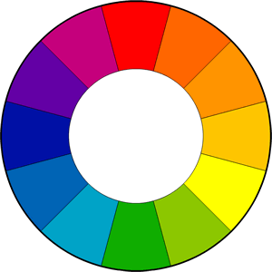
Green and purple can work also.
Unfortunately, Christmas ruined red and green, but red still goes well with black or white.
Too many colors can be distracting, so try to go for one or two main colors (if the whole background is blue, you could use yellow text to stand out…)
What kind of images should you choose?
First find a dramatic background or scene; it can be a building, landscape… think “place.” Where does your novel happen? What’s the setting? See if you can find something that refers to this. That will be your background.
Then find something for the foreground – faces or bodies can work well here.
Models from stock photography sites are good, but the better the model, the more chance someone else will use them for their covers. You can avoid showing their face by just showing some of their body or posture.
You could also post something on Craigslist and see if you can hire someone local to pose for an hour or two. I’m sure you have a friend with a camera… describe what type of model you’re looking for and have them send samples. I would pay $50~$100 for a couple hours photoshoot, with the rights to use a picture on the cover.
Take the pictures against a white, or black background (depending on whether your cover’s background will be mostly light or dark.)
If that sounds like too much work, find a model on a stock photography site, but keep in mind: the better the photo, the more likely other people are already using it on their book covers. That’s why you don’t want to find a beautiful, breathtaking photo that’s just perfect. You can… but there may be another book with a cover that looks almost exactly the same.
Instead, try to find something a little plainer, mix the model and background together yourself, or choose to focus on a unique angle (I often cut off the top half of a model’s face and show just the mouth and chin). You could also put some unique objects, symbols or elements in the foreground. Something that also works well is to place the models large on top, and add a scene/landscape on the bottom half of the cover.
Make a list of your character’s physical descriptions, and any other relevant places, scenes, rooms, objects or symbols, and start searching.
Where to find stock photography
“Stock photography” means images you can buy the rights to and use in your book cover. More expensive sites will ask you for more details like how many copies you plan to print, but there are a lot of cheap options.
I use these sites, where photos usually cost less than $10 to download (although you should buy the more expensive “Extended License” if you are using it for your book cover). Each site has different rules and fees. For now, just download samples of everything you like so you can play around with them. Once you’re sure what you want, you can go back and buy them.
What size do I need?
I make book covers at 6”X9”, which is 1800×2700 pixels. That’s already a good size for print, and for Kindle and other ebook sites. If you want a taller, narrower book cover, use 5”x8” – that will produce the 1.6 ratio recommended by Amazon (which most publishers ignore, because the covers are too tall and look strange on most devices).
On most stock photography sites, a medium or large size will work, just check the pixel ratio. Keep in mind, if you choose two horizontal photos, they don’t need to be as long as the full cover.
Here are the sites I use most often:
There are others though – even some free options, like Stock Exchange photos.
They reel you in, showing you nice photos from iStock, which usually cost between $20 and $80.
Other options
The disadvantage to stock photography, as I’ve mentioned, is you’ll see it on other covers, so here are some ways to find something unique.
1) Find a professional photo from a photographer’s website.
Photographers often charge at least $1500 to use a photo as a book cover; however, many are open to a special deal or agreement. Something I’ve negotiated in the past, is paying around $250 now, but an additional $1000 or so if the book sells more than 10,000 copies. This is pretty fair to you both – if you do sell so well, the photographer deserves to get paid his normal wage.
2) Find something on Etsy.com
Etsy is a site for craftspeople and artists, but they often have some very pleasing photography of their wares. There’s also some unique paintings and art. Most artists won’t mind if you use their photos, especially if you buy the relevant product they’re selling. Just make sure to ask.
3) Find something on Flickr.com
A lot of Flickr users post photos in the Creative Commons area, which means you can use their photo as long as you put attribution (on the back cover, and on the title page). No harm searching this area. The photos may not look great at first, but you can adjust them in Word.
http://www.flickr.com/creativecommons
4) Look on DeviantArt for photography
DeviantArt is a community for artists and graphic designers. They have a resources section of stock photography, that you can use as long as you attribute the source (different artists have different rules of use, and can be quite cautious how their work is used, so you should read their rules and maybe send them a message).
The stock photography on Deviant is usually very raw – it’s for graphic designers to use in their designs.
If you see a photo that could work, maybe see about finding someone to make it awesome for you (read 5 and 6).
http://www.deviantart.com/resources/stockart
5) Hire an artist from DeviantArt
Browse DeviantArt for the subjects on your list and you may find some beautiful art and photography. Especially for a children’s book or fantasy novel, if you need a really specific scene, you may need to hire an artist. A lot of artists on DeviantArt are young or just starting out (or in other countries where the minimum wage is much lower). I would offer $100 to use some art on a book cover, or $250 for them to draw something custom for you. Some artists will work for less, some will demand more – but I think those are good starting offers.
http://www.deviantart.com/resources/stockart
6) Pay someone on Fivver.som to make it awesome
I’m going to teach you how to style and blend photos in MS Word, but if you need something prettier, or are getting frustrated trying to do it yourself, search on Fivver.com for a Photoshop expert. Many providers will strip out background, combine images, or add a dramatic style for $5. It’ll save some time and probably look better. Especially for YA, fantasy, science fiction, thriller… anything that needs to be “edgy” or a little more exciting, could probably use a touch-up.
http://www.fiverr.com
7) Find an old painting
Thinking of using a historical painting? Almost all old paintings should be free to use if they’re older than 70 years. Check out this site, it has tons of high resolution painting and art pictures:
http://www.wga.hu/index.html
Got your pictures? Let’s start!
I’m going to walk you through making a book cover in MS Word from scratch.
Step One
Open up MS Word.
Go to “File>>New>>” and then hit “Create” on the right side.
You should have a blank document.
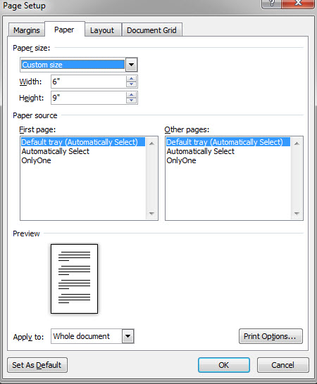
You’ll want to adjust the size to 6”x9”, so go to “Page Layout” and hit “Size.” Scroll down to “More Paper Sizes” and type in 6” and then 9” in the relevant input boxes.
We also don’t need the margins so big, so click again on “Page Layout”, select “Margins” and then set them to “Narrow” or .5” all around.
Step Two
Now we’re going to add our pictures.
I’ll take my scenery or background picture and drag/drop it into my template. I could also use “insert>>picture” and then select the image I want to use.
When the picture gets dropped in, it will automatically stretch to the margins, but you can’t move it where you want. Double click on the picture, go up to “Wrap Text” and choose “Behind Text.”
This will let you scale, resize and move the picture around. I’m going to move it down to fill up the bottom of my book cover.
Quick Tip: if you need to get a better handle on things, you can either zoom in or zoom out under “View” and then “Zoom.”
Now I’m going to take another picture, drag and drop it in, select “Behind Text,” and put it in the top half. The picture is too big, so I lose half of it under the other one (we’ll fix that later).
Now that I have two layers, I’ll want to click on “Page Layout” and open up the “Selection Pane.”
This will show all my layers, and make it easier to keep track of them. If I want to hide one for a while, I can click on that “eye” button, and show it again when I’m ready. Sometimes it can get tricky to select the right layer when I have a bunch of them. If it’s hard to select the image you want, try double-clicking right on the border of the picture, rather than the middle.
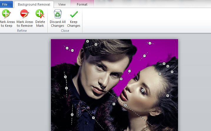
Just for fun, double click on the picture of the couple again, and hit the “Remove Background” button on the top left. It doesn’t work so well with this picture, because the background is too similar to the portraits in color, so we’d have to use “Mark areas to keep” and “Mark areas to remove” until we got it right. Then we could add something else behind it, like a nice starry night sky…
But we won’t do that right now.
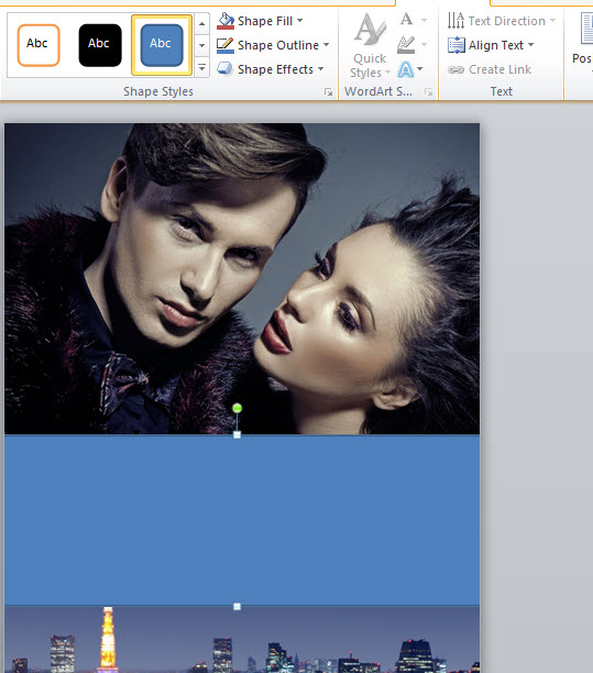
The simplest way to finish up this cover would be to add a flat banner across the middle.
Quick Tip: if you need to go back and remove some changes, hit the backwards curving blue area on the very top left, next to the save disk icon.
Step Three
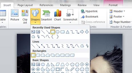
To insert a banner, go up to “insert,” click on “shapes,” and then select the rectangle.
Now we can drag out a rectangle. It’s OK if it’s not perfect, you can resize it and move it around. I’m going to double click on the rectangle to select it, go up to “Shape Outline” and hit “No Outline.”
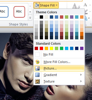
I’ll do that again, go up to “Shape Fill” this time, and select the color black.
Step Four
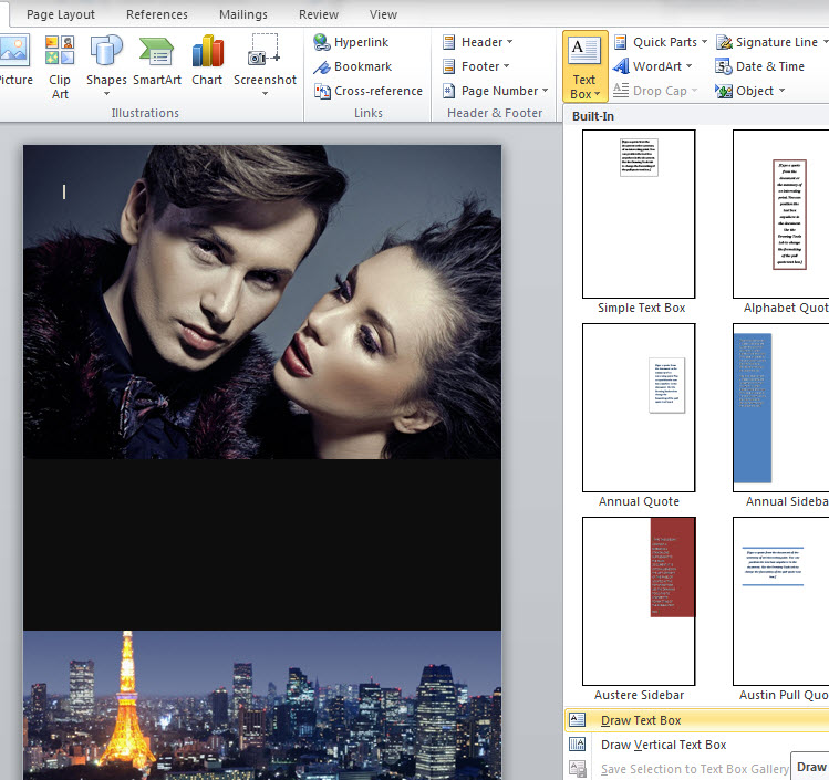
Now I can add some text.
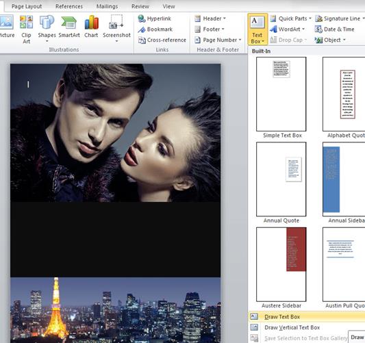
I go back to “Insert” and hit “Text Box,” and choose “Draw Text Box” from near the bottom of the choices.
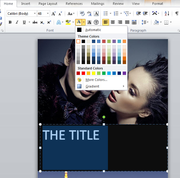
At first my text box has a solid white background. So I’ll double click on it, go up to “Shape Fill” and choose “No Fill.” The box also has a border I want to get rid of, so I double click on it again, go up to “Shape Outline” and pick “No Outline.”
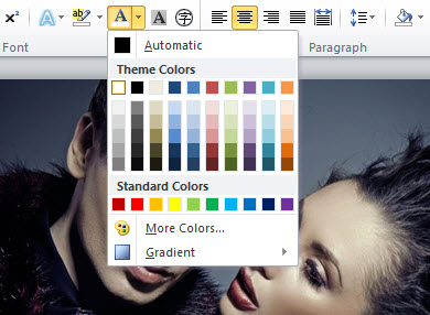
But now if I type my title, I can’t see the black text… so I’ll highlight the text and go up to the “A” symbol to change the color. For now I’ll just pick white, then make the text a little bigger.
Rules for using fonts:
Using the right font for your book’s genre is important.
You can’t go wrong with some fonts. Here are some of my favorites:
Lato, open sans, liberation sans, English gothic, bebas neue, Optimus princeps, trajan pro, garamond, pandama, Shonar Bangla… here are some things to keep in mind:
- Don’t use anything that comes with Windows – your basic fonts like Comic Sans, Times New Roman, or Mistral.
- Try to use two fonts, something “cool” for the title, and something clean and simple for the author name (although if you want to create an author brand, you could reverse this, and make something memorable for the author name.)
- Three fonts is OK if two are pretty simple (for example, to use in the tagline or review)
- Don’t use more than one super creative, unusual font.
- Search around. There are thousands of fonts. Find a great one. Understand that you may have to pay for it.
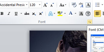
MS Word’s maximum font size is 72pt, but you can just type in a new number.
I’ve set mine to 120pt. I’m going to use a font called “Accidental Presidency.” It’s a narrow, bold, sans-serif font, similar to English Gothic or Bebas Neue.
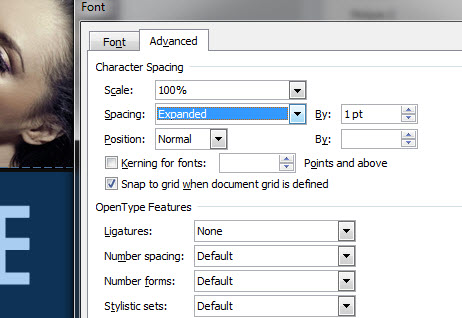
But I want to space out the letters a bit, so we need to learn the very important skill of spacing letters.
I need to go up to the Home tab, and underneath the “Font” section I click on that tiny little diagonal arrow.
That’ll bring up a new “Font” window. Click on the “Advanced” tab to see the “Spacing” option.
You can set the text at “Expanded, Normal or Condensed.”
I choose Expanded, and set it at 1pt. That’s not as spaced as I want, so I do it again and choose “by: 3.5pt.”
I want to center my text, so I drag the walls of my text box to the edges of my cover, then click the center text icon. If it seems like the text isn’t lining up right, go up to the Paragraph section, hit the tiny diagonal arrow, and make sure the Indentation is set at zero.
Now I want to add an author name under the title.
But if I hit Enter/Return, the next line is too far down. I could try to fix the line height, by hitting the Paragraph options and setting the line-height to 0.8”, but too much and it will start cutting the top off the text. So the better option is to select my title text box, by clicking once on the border of the box, right click and choose “Copy Here” (or use the ctrl+”C” shortcut).
Now you have a duplicate text layer. Make the font size smaller, and increase the spacing. I set the size at 36pts, and the spacing to Expanded by 10pts. Accidental Presidency looks a little too bold, so I changed the font to Vodafone Rg.
Finally, I want my title text to “Pop” a bit more. If I click the little “A” symbol with the blue glow, I’ll get some special text features. If one of these styles doesn’t work, I can customize the Outline, Shadow, Reflection or Glow.
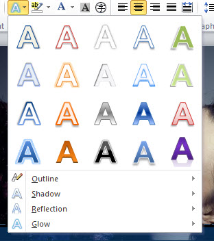
The “Reflections” is interesting, but only if I go to “More Reflection Options” and change the transparency a little.

But it’s not quite what I want. So instead, I’ll highlight the text and go up to the “A” with the white bar underneath to select the Font Color options.
Besides changing the color, I can also select a Gradient option. With a light border and subtle reflection, the cover looks pretty good.
Step Five
But I think I can make it better. Try selecting that black rectangle shape behind the text.
First I’m going to search online for a “black, textured background”. I want something “grungy” so I picked this brick wall.

If I click on the border of my black rectangle, I can go up to Shape Fill, choose “Picture” and upload my brick wall background.
Quick Tip: if you’re having trouble selecting the black rectangle from behind the two text layers, use the “Selection Pane” which should still be on the right hand side of your workspace. You can select the layer there, or hide the two text layers for now.
That looks OK. But now the straight lines of the rectangle box are starting to bother me.
Let’s get rid of them.
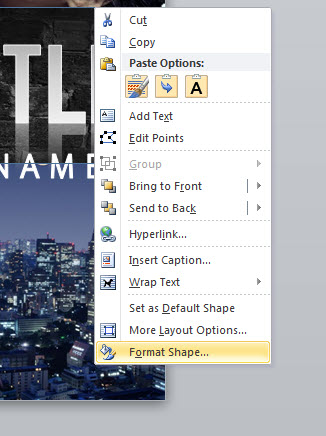
Select the background rectangle again by clicking once on the border, but this time right click and choose the last option, “Format Shape.”
This opens a new window, and we can now access the “Glow and Soft Edges tab.”
You want to make the soft edges big enough so the image transitions smoothly into the other pictures.
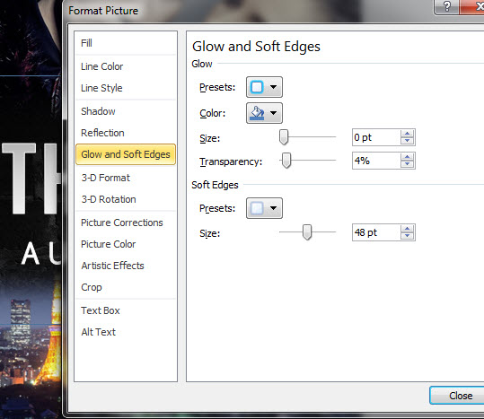
It still doesn’t look smooth, so I’ll try adjusting the colors.
I selected the background Paris shot, and used the “Corrections” and “Colors” tabs on top to change the picture to a dark brown that matches the bricks better.
Step Six
That doesn’t look bad at all.
But let's see if we can add an element of danger by blending in another picture of this bad guy.

First we need to make some space, so we’ve got to select the picture of the couple, grab one of the corners, and pull it down to scale the size.
You may need to move it over first so the corners are visible.
Then, since this is a dark cover, let’s get rid of that white background.
Go up to “Page Layout” and click on “Page Color.”
Quick Tip: If you wanted to fill the page with a gradient, you would hit “Page Color” and then “Fill Effects.” Gradients are handy for non-fiction.
I click on “More Colors” and try to match that dark brown of the Paris sky as closely as possible.
Now I can drag in the bad guy picture, “Wrap Text”/”Behind Text” to move him around, and “right click/format picture” to soften the edges.
I also used “Corrections” and “Color” to make him fit in with the background color better.
I added soft edges to the couple picture as well, but unfortunately these two images don’t fit so well together. I may be over-reaching.
I changed the color of the couple picture, to blend them together better, but now the cover is monochrome and a little boring. I could add red text…
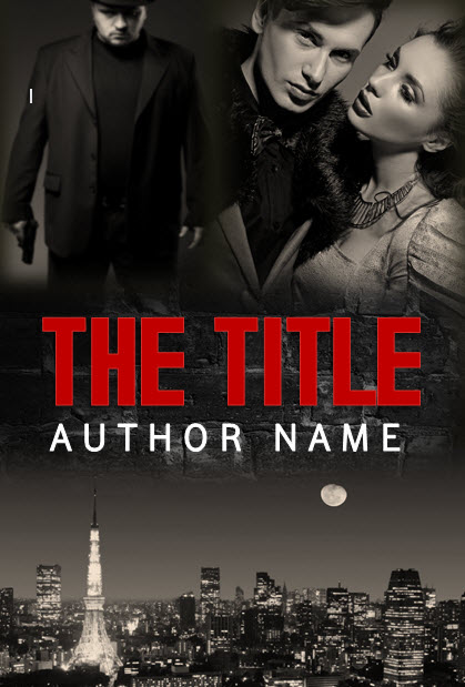
But I think the colors were stronger before.
So I hit the “revert” back arrow about 200 times…
Quick Tip: Save frequently! And if you like something, save it, and then save again as a new file before making big changes or trying something else.
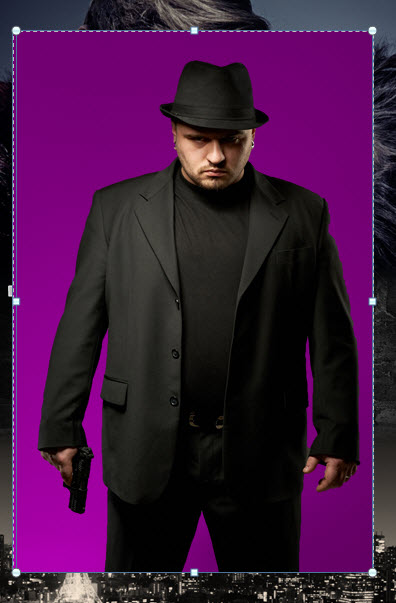
This time I use the “Remove Background” button (once you click on the picture, it will be on the top left, under “File”). It does a good job of stripping everything out.
I want to put him really small, on the bottom half of the cover.
And this is where I hit one of the big limitations in MS Word.
For some reason, “Shapes” have to be in front of “Picture Layers.” What this means is I can’t bring my bad guy in front of that brick layer.

Luckily, there’s a work-around this time.
I started that layer as a shape, and I used “Fill” with the brick picture.
The cool thing about shapes is I can change the Transparency. You can use Transparency to put an image right over another one.
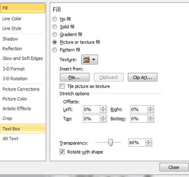
Normal pictures though, don’t have that transparency option, only shapes do. And shapes have to be in front of pictures.
But, since I don’t need transparency right now on the brick layer, I can just delete it, insert the brick picture directly, by itself, and set the edges to soft.
Now that it’s a picture, I can put it behind the bad guy.
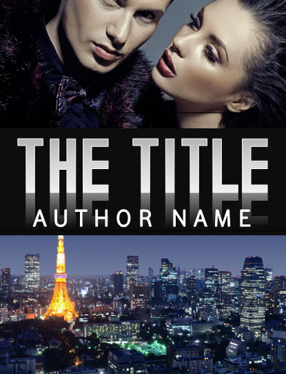
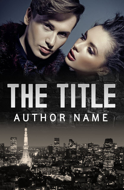
I like him so much, I’m going to make the author name a little more condensed so that I can fit him in better.
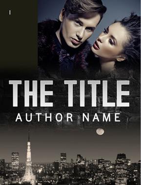
And…. Tadaa! For a cover made in MS Word in under an hour… it’s pretty good.
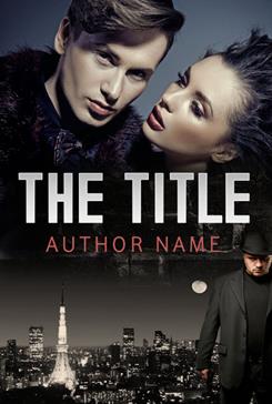
The fonts aren’t ideal… I’d try to find something a little edgier/rougher for the title and cleaner for the author name.
Quick Tip: A white outline on text with a gradient will make a ‘gleaming edges’ look, like in this sample. It’s good for strong, clean fonts, but not good for rough or messy fonts with uneven edges. An outline will also make the text a little bit fatter and not quite as clean and sharp, so it should be used carefully.
If you didn’t get it earlier, link to the source files and template used in this tutorial.
DIY Book Cover Templates
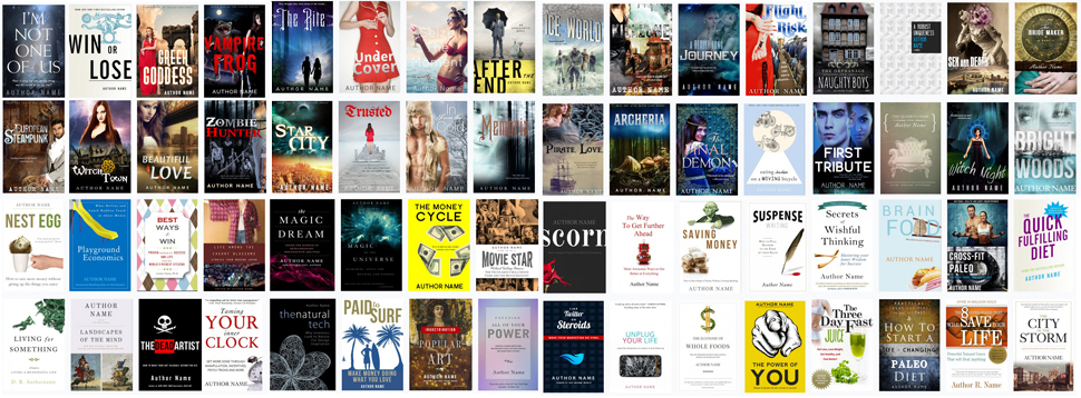
With the methods you’ve just learned, you can make a pretty great cover by yourself in MS Word. But there’s also a lot of potential to fail. When you’re starting out learning a new skill, it’s good to have limitations, structure, guidelines, a roadmap. That’s why I’ve been working on over 100 DI Y book cover templates based on best-selling book covers, which are a lot faster and easier than making your own cover from scratch. You can just about point and click your way through customizing one of my templates in 5 minutes.
If you’d like to find out more about that and download some free templates to play with, check out DIYbookcovers.com.
If you'd rather work with a professional book cover designer, you'll find a list here.
Please leave any questions or comments below!

Hi fellow MS Word friends!
I am almost there with releasing my original guitar method book. I had someone make up a cover for me, but there are some adjustments I’d like to make to it myself. Unfortunately, that pretty much has me doing the whole thing over again. Where I’m getting stuck is I do not know how to be confident that I am using the right measurements so that I can print off copies of my book using create space.
The book is 8.5 x 11. A little big b/c it is a music method book meant to be used while playing.
Any insight into how I can do the cover myself at little to no cost with the right measurements would be very much appreciated!
I’ll write a follow-up post soon about making a full print cover for Createspace in Word, along with some templates. It’s a little trickier to get the dimensions right, it’s probably worth hiring someone on fiverr – if you give them the template and your cover art, it should cost around $25 for them to finish up. It may not look amazing though… You can also use your cover art in CS’s cover Creator, but you’ll need to move the text away from the edges. Anyway, a long article on this coming soon, I’ll post it on http://www.diybookcovers.com when it’s ready.
Thanks so much Derek for taking the time to respond to my dilemma!!!
Hi Joanna,
Thanks for this lovely and detailed tutorial for making your own cover. You’ve also helped me write my blurb after reading your advice and watching your most helpful video about how to do it. I find myself on here a lot and thought I should just say thank you and please keep up the great advice!
For those of you still struggling with how to convert a word document into a picture, here is what I did. (The PDF way messed up my mist)
1. Zoom in or out so you can see your whole image.
2.Press the ‘Print Screen” key on the keyboard. It might be abbreviated to look something like
“prt sc”.
3.Open paint. Press “Control” and “V” keys at the same time on the keyboard. Your document should be pasted.
4. You can edit it here, or wait and edit it with another program for pictures. (There will probably be a copy of your toolbar and whatnot that came with your document)
5.Select “File” menu. Choose “Save As” and select “JPEG”. It is now a graphic imagine.
Here’s another way of getting from a word doc to a JPEG if you have OneNote on your pc.
1. Bring up the document you want in Microsoft Word.
2. go to Print.
3. Select ‘Send to OneNote’ on the Printer Menu and click “OK”.
4. The document will open as a page in OneNote. Make sure this is the only page open on the tabs on the right (delete others if open by clicking on them and pressing the DELETE key). Then, go to File/Office Button, then Save As.
5. Change the File Type/ Save As Type dropdown to ‘Word Document’. Then Click SAVE.
6. Open the new file in Word. It will open with the pages as pictures.
7. Now right click on each picture of your page, and click Save As Picture. Save the picture and you’re done!
Anyone know how to put a header using Word 2010 so that it is different on even vs odd pages, starts on page 1 of the content (page 8 from the start after the first pages and
intro.) and does not affect anything else?
Thanks, Murray
Yes, I’m actually working on some interior formatting guides and templates now at:
http://www.diybookformats.com
I have been publishing an art poetry zine for two years as an e-book. I created all my book covers using ms paint and picasa. Currently, right now, I’m formatting my latest issue (of Randomly Accessed Poetics, Heart Splatters Into Significance) as a CreateSpace print book.
My question is, after reading 10% of your article, is that will a MS Word generated cover work for CreateSpace or other PoD uploaders?
If I continue formating print mags I am going to need software to build book covers. I don’t make any money as a (poetry) publisher and I don’t want to spend 100’s of dollars on adobe products if I don’t have too.
I’m finishing some sample templates for full print covers soon; you could also use Word for the front cover and Createspace’s cover maker software to finish the back and spine.
A great article regarding book covers, it is worth reiterating the importance of licensed imagery, there are some good places for stock imagery where you can get photography or if you’re lucky (like us) you can use a photographer to create your image for you.
Many thanks,
Dave
http://www.jdandj.com
I am lucky, because I know a lot of artists and I myself can take a picture.
What I don’t possess is adobe products. I don’t make any money as a book publisher and thus am reluctant to layout several hundred dollars on software. I am going to try and design my next book cover in gimp. But I guess I should also try and do one in word too.
What if I don’t want to use multiple photos for my cover, only one?
I have tried creating a cover in word but it does not appear too good. I am using MSW 2010. I can’t pay any amount for now FOR MY COVERS because I have not sold any of my four books. I will give it a try may be…
Dear Derek,
I am 85% done with my first book.
But I need a professional looking cover design.
I would like to know how much you would charge for the fee
I appreciate your DIY presentation herein but I believe someone who has the expertise and experience must do what I need.
I appreciate receiving your kind response.
Thank you.
Truly yours,
Efren A. Galapon
MBUZZ
Riyadh, Saudi Arabia
+966 54 805 46 15
http://www.iodynamics.com
I literally never imagined you could create a cover in MS Word, especially such a great one. I usually use GIMP, but I want to give this a try
I tried uploading this as a cover for a site called watt pad, but I can’t seem to turn it into a jpeg or into a picture format.
I’ve been experimenting with this. Lots of fun. I saved the word document with my cover as a PDF file then imported it into Gimp and exported it as a JPEG. A few steps but worth a try.
This is great advice! I’d never considered using Word for a book cover. As some of the commenters above have mentioned, I’ve fooled around a little with gimp–which is a free download (GNU software, unlike its Adobe counterparts), and has even been used for making the images found in some of the latest video games.
The issue with gimp, which is both its strength and weakness, is that it takes a bit of expertise to know how to use all its features. This article presents a very workable means of what looks to be a pretty decent book cover, without having to have a degree in graphic design. Regardless of the route you go, this seems to be the future of fiction writing: taking all or most of the elements of producing a quality work–from writing, to marketing, to producing your own cover art–into your own hands.
While I haven’t sold any of mine to date, my hard drive is aching to get some of this stuff into ebook format, and move forward. Thanks for the advice!
Great post, thanks. I made my own book cover which has had a lot of good feedback. I used a combination of hand drawn images (including the text) which I scanned in and reworked and coloured in photoshop. I think a hugely important factor in the process is ideas and comments from friends and social network contacts. While making mine, I posted countless options on facebook, etc. for review and votes, which I have to say was invaluable! Here’s a link to it if you fancy checking it out 🙂 : smarturl.it/daveynorthcott
Great instructions – thanks! I feel I could create a beautiful cover using my own photos for my book now.
Only thing is – could you let us know how to use Word to create the wrap around cover for the printing of the book? With two sides (front and back joined) together with the the spine in the middle for the title again – could we create a template for this to have the book and cover printed, what measurements would we use in word?
Best wishes! x
Yeah – I added another sample package with instructions for making full print covers, you can get it here:
http://diybookcovers.com/free-sample-thanks
I don’t see any instruction on how to convert the word doc to jpeg on a mac. I’m stuck! I managed to do it on my old macbook, but now that I have a new macbook air, I keep losing the background color when I save it to pdf first. Please help…
Hi Dina, sorry you’re having trouble. To make a JPG you have to use an online converter. I also have problems when saving a Word file to a PDF sometimes; you can try various options, like “save as, print as, export as” or see if there are any Word plugins – or you can try a couple different online “Word to PDF” conversions, sometimes one will work while another won’t.
I tried designing a cover in Word 10 but Word converts all pictures to 120 DPI as against 300 DPI required by Createspace. Can you suggest a work around?
Hi
Thanks for the help. I learned a lot. I made my cover from scratch.
Is there a way I can save it in pictures with the fonts intact?
Thank you
Rob J
The fonts should stay the same when you save it as a PDF, there are a few ways to save as a PDF, so if one doesn’t work try another (“print as” or some online converters will work).
A lot of people have been asking about making a full print cover for Createspace with MS Word – I added a package at http://www.diybookcovers.com but in case you didn’t see it, I just put up a long guide with some free templates:
How to make a full print book cover in Microsoft Word for Createspace.
http://www.creativindie.com/how-to-make-a-full-print-book-cover-in-microsoft-word-for-createspace-lulu-or-lightning-source/
Do i need permission to used the picutres i used for my book cover like the background and the people?
Yes, you need permissions for all the images you use. Here’s an article I wrote with more info:
http://www.creativindie.com/copyright-laws-for-book-cover-art-stock-photography-licenses-and-other-things-you-should-know/