OLD POST ALERT! This is an older post and although you might find some useful tips, any technical or publishing information is likely to be out of date. Please click on Start Here on the menu bar above to find links to my most useful articles, videos and podcast. Thanks and happy writing! – Joanna Penn

My thriller novel ‘Pentecost' is back from my editor and I am in rewrite mode. I am putting together my marketing plan and am currently just over 3 months away from launch (expected to be Feb 1st 2011). I will soon be putting together the back blurb and letting you read a few chapters, but to start the marketing in earnest I need to get my front cover sorted.

In the last few weeks, I have been working together with Joel Friedlander, The Book Designer who has put together some fantastic options for my book cover.
I have included a number of iterations in this blog post for you to see and also to vote on in the survey at the bottom of the post. I am deliberately holding back detail of the book's plot as I want you to make a decision based on the cover.

Is this a book you would like to read? Does the cover attract you or turn you off? Which cover makes you want to buy the book? (If none of them, do you have any suggestions?) Please add your preferred cover number in the survey at the bottom of the page and any suggestions in the comments of this post.
The process for any kind of design is iterative so it is important to remember when you get the first lot of images that they are not the final options. I sent Joel a draft of the novel so he could get some ideas, and he had a first pass at cover options giving me 9 different covers to comment on. I sent back comments on colors I liked, wording, fonts, images and Joel went round again. We did this several more times and narrowed down the options I specifically liked.

Some of the aspects I particularly wanted to include were:
- Fire and flames, given that the book is called ‘Pentecost' and fire is an overall theme
- The words ‘a novel' or ‘a thriller' as I have noticed that the bestselling books are doing this now
- A cover that is clear when sized as a thumbnail
- My name clearly displayed as I am building a brand. It doesn't matter so much now, but in a few years time it could be more important. One of my favorite authors Matthew Reilly did this when he got started, and now he is huge in the action/adventure/thriller genre.
It's good to have some of these ideas in mind when you work with a designer, but also be open to their thoughts as well since it is their job to come up with new images.
Joel has some more great tips for book cover design here including:
- Establish a principal focus for the cover, and stay with a few images. Don't clutter.
- Avoid white backgrounds and make the text stand out with a title font that is easy to read
- Have a look around at other book covers from novels/books in your genre to see what they are doing
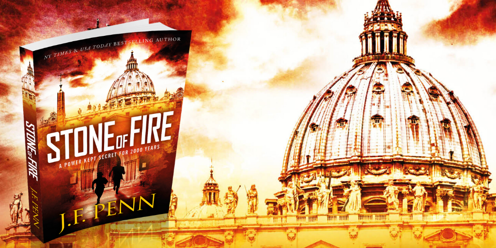
Pentecost was re-edited and re-published as Stone of Fire in 2015.
I chose # 2 because I like the contrast between the flame and background too. I think the other flame in # 4 is too much and the other two images don’t give you enough of a glimpse of the scene behind the flames.
I liked the 1st one best, but they were all good covers. 🙂
I voted for the second one. I like the contrasty image. And it will stand out from the shelves and as a thumbnail and grab attention.
I like No. 2 overall, because I can see the building in the back and it’s an interesting thumbnail, which is how I shop. Personally, I’m tired of grunge type fonts, whether they make sense or not, but I’m also not really sold on the other font. But, as far as the other font goes, I liked the inclusion of a cross (and wasn’t offended, though it’s not my cup of tea). I also liked that you included “Thriller” and that your name is big and bold. I know it’s not particularly done in the thriller genre, but for some reason I wanted to see people on the cover. For the life of me, I don’t know why, but I wanted some sense of the protagonist(s), male or female, clergy or no. Maybe my interest is already piqued because the title is conveying at least an association with the biblical story. Anyway, as a reader of thrillers, I’d definitely take a peak at the blurb based on cover No. 2.
Hi Terry, That’s interesting that you wanted people on the cover. I particularly didn’t want people on there and rejected the proofs with a person on. The trouble with including an image of a person is we all judge the book based on that character. Do we identify with them? My protagonist is female but with a male partner and they both have POV in the book. The antagonist is male. The plot is based on the biblical story of Pentecost.. more to come when I release some chapters! Thanks.
Hi Joanna,
Sorry I dont have website yet. I will rather choose the forth cover design, I think it looks sharper than others. Pentecost always follow with the word “fire” as you design the book. When the Apostle received the baptism of the Holy Ghost for the first time there was symbol like fire upon there fore head.
Thanks Nicholas – I did indeed choose fire because of what happened at the biblical Pentecost… more to come when I release the first few chapters.
2
Excerpts from emails:
Paul Johnson: (thanks for great document Paul!)
Anyway, all other things being equal, I would go for Option 4 of the book covers, mainly because the flames in that option are instantly recognisable – which they are not in thumbnails of the other options. However, I believe that Option 4 could be improved further and there were some good features in Options 1, 2 & 3 which may be useful with a slight rearrangement.
Tom Drinkard:
I voted for option #2. The script wasn’t loading properly and I’m not sure the vote counted. Just wanted the vote to count.
Dominic Fahr:
I elected for cover 4. I always keep mine fairly simple… just flowers and things, as the latest two, which I’ve attached. I’ve always kept my covers simple… apart from a brief spell when I was at UCNY, too many years ago, and knocked out pulp fiction at $200 a throw! Now I mainly write for the German, Scandinavian and Russian markets… which having been (from a publisher’s point of view) something of a success, hence they are now publishing in Britain!
Wish you luck… and happiness
Dominic
Barry Caulfield:
Book cover options all show fire. I don’t know what your book is about so I’m not sure what fire stands for. If it’s religious then it should be a tongue or tongues of fire. Pentecost means 50th day. Spiritual enlightenment. It all depends on the content of your book and the point you are attempting to make.
Frances Jeanne Scott:
Dear Joanna, leave it to me to be difficult. I chose 4 because Pentecost in black held my attention in comparison to the other choices, but I preferred your name as it appears in number 1! However, I am not an expert in book cover design, nor a connoisseur of Thriller cover appeal! Wishing you success! Jeanne Scott
Jo Craig:
I went online and selected Option 2, but I hope you don’t mind I’d like to comment with something different. I like the background of Option 2 with the small fire, etc. that looks really good. But change the font title to same as in option 3, and leave the title ‘A thriller by and your name at the bottom’.
Leo Overbach:
It is difficult to decide on a preference for your cover when I know so little about your book. You are using an independent publisher. How will the book be marketed? Where will it be available? I voted for Option 2 because it is subtle and arouses my curiosity more than the other options. What interests me is why you have called it Pentecost.
Good luck with the marketing & sales.
Regards Leo Averbach
Todd Norman – Option 3 is the best cover.
Hi Joanna-
I love your podcasts! I like a bit from each of the covers and would mix and match if I could. Standing Alone, I would pick #1. Still 1,2,3 all have the gradient to black with your name and I think that looks much better than the all white with no gradient on #4. I like #1 for the color amber chosen with your name because it is clear to see, but also not the first thing I see. It mixes well with the flames, but allows “Pentecost” to capture my eyes first. I also like ‘a thriller’ close to your name. I am a conservative Christian, but think #3 aims for such an audience and it might be best to have as broad an appeal as possible. 1,2 both have an awesome font, but I might clean it up even a bit more to make it more clear. I hope it has wonderful success and can’t wait to read it. My last comment is that it seems like 1 and 4 have a different brightness on flames. I prefer the lighter one on 4 as you can make out a bit more of the church style architecture in the background.
good luck
I quite like option #2. The facade in the background hinted at location which I liked,. The other options with a full flame front did not hold my interest. The font on option #2 was also more interesting than the others.
Hi Joanna,
I’ve been reading your blog for awhile now. Congratulations on the book. I’m looking from a signwriters point of view. All the principles are the same as a book cover. Less is best and space is important. I chose 1 for these reasons
1. We read a novel for the emotional experience and 1 had the most warm an inviting appeal.
2. Your name us in a harmonic colour theme with the cover but not overpowering the title
3. Space and distance around the copy is as important as the location within the overal design
4. The first design comes the closest to achieving overall balance in layout and design principles
Hope this helps
Darren
Thanks Darren. That’s really useful coming from a signwriter’s viewpoint.
I chose #4 because the fire looked more intense which would be in line with a thriller. To me fire means either a cleansing or eternal damnation. Not knowing what the book is about I would go with #1 title font if it’s eternal damnation, and #3 if there’s redemption. Also, I prefer your name and “thriller” in #1.
Best of luck – Sharis
Hi Joanna,
Out of the 4 samples I choose No 2 as it is more distintive and stands out far more than the others, which to me just look a blob. None of the others make one feel that you should pick up the book to see what it is about. I think ıts essential that the sub heading a Thriller should be clearly written above the name of the author.
Good luck with your publishing the book that I look forward to reading more about.
Hi Colin, we will definitely be making “A Thriller” stand out more, and it has been a repeated theme that 2 makes people more curious (which is very important!) Thanks
Hello Joanna, I have to admit that I like them all, but I am going for No.2. Pentecost is a religious festival and the use of the fire and the word ‘Pentecost’ made me feel that as a ‘thriller’ it must have a religious element – rather like Dan Brown’s ‘Angels and Demons’. I believe it gives the subject a real feeling of intrigue and the intense excitement to come.
Good luck with Pentecost.
Thanks Phyllis. I absolutely want to invoke the spirit of Angels & Demons. That is the audience I want to capture exactly!
With the book coming out in February, I would pick cover #2. If it were coming out in the fall I would pick one of the others. Fall covers tend to have more warm colors and those coming out in sprint (February counts) tend to have cooler colors, so you still get the flame in the middle but the background balances out the intense colors. Good luck!
Hi Amanda, That’s an interesting viewpoint. I’m not sure where you are in the world though as fall down in Australia is different to the US!
The flames in option 4 look the most realistic, but perhaps they should fade to black at the bottom, with your name in yellow for greater contrast.
As for the title, I would choose option 2, but I would suggest putting it in black and making the second letter “t” crucifix shaped like the first; the two faux descenders framing and accentuating “a thriller” displayed in white.
I would definitely NOT use the word “by” on the cover.
Thank you [two words, not one?] for asking my opinion!
Oops.
Correction: “As for the title, I would choose option 3….”
Thanks again.
I asked the whole project team to vote (Ray, John Mac, Kevin, Janet and I) and we all agreed on #3.
Excellent progress – can’t wait for the sample chapters!!
Lizette
Hi Joanna,
I like number 2 because it draws me in and makes me want to look more closely. The other 3 are ‘what you see is what you get’.
Hi Joanna
I voted for Option2. I liked the faded backdrop against the flame and I liked the text. However, I liked the dropped ‘t’ of Option 3 which is very evocative of the title. How about combining this in Option 2?
Cheers
Lynn
Hey there Joanna,
You could do endless variations based on these design directions. As they stand though, I felt myself leaning towards option 2. Perhaps consider lifting the white Pentecost title from the light grey background it’s on ever so slightly. Cover option 4, sticks out like a very familiar royalty free image, lacking elegance the 2nd option beholds.
All the best!
Anthony
Thanks Anthony – I know you are a great designer so this is helpful!
Option 2 – seen on an iPad with two fingers reducing the size, it’s the only one with any definition left – as above though, a clearer, less broken font for the title might help unless it resonates some way with the story
Thanks Tom. That’s great feedback. We are redefining option 2 at the moment based on feedback. Video to come!