People do judge a book by its cover.
You want the best possible cover for your book. And if you're self-publishing, you do have to go through this process, because designing your own book cover is a bit of a no-no unless you have some book design chops, which let's face it, most of us don't.
Watch the video below, or here on YouTube, or read the article below.
How do you find a designer?
1. Look at books that you like
Preferably have a look at books by other indie authors, because most of us will credit our book cover designers inside the cover. Use the Look Inside function on Amazon. It should be listing the book cover designer or in the acknowledgements of other books that you like.
2. Ask other authors
I have my own curated list at TheCreativePenn.com/bookcoverdesign. There are lots of vetted and recommended book cover designers there.
Tips for working with a designer
Once you've found a designer that you like the look of, the next thing to do is to discuss with them how you're going to work together, and also things like price.
The price you pay for a cover is going to depend on what you're asking for. For example, lots of book cover designers do off-the-shelf covers, and sometimes they may cost about $100. That can go all the way up to around $400 to $500.
This can go up much higher if you want custom artwork, which some authors love investing in, particularly in the fantasy genre, where the author is getting interesting creatures and spaceships designed.
The cost for a book cover really depends on what you're looking for in your cover, but you'll need to discuss that upfront with the designer, very important.
You also need to discuss the number of iterations that are allowed in the design process.
Pick a designer who works in your genre, has good testimonials from other authors.
And finally, pay your designer promptly. If you want a long-term relationship with any professional, whether it's a graphic designer, book cover designer, editor, website person, you need to be as good a client, as they are a service provider.
An example of working with a designer on a new Cover
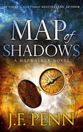
My designer is Jane at JD Smith Design. And she's worked on most of my fiction and non-fiction covers now. We have a well-worked out process, but because this was the first in a new series we went through a number of iterations, which I'll show you.
This process will be the same whether you're writing fiction or non-fiction.
Here are the steps we went through:
1. Give the designer the information she needs
Once you've engaged a designer, the first thing to tell them is the name of the book. That might sound obvious, but, of course, Map of Shadows, originally was actually just called, “The Map Book,” for most of the time I was writing it.
You may start working on your cover design in advance of when the book is completed. If you don't know the exact title, that's fine. You can start the design process, although it is better to have a fixed title. You'll obviously also need your author name, which again, might sound simple, but that is something that people change.
I went to Jane with, Map of Shadows: A Mapwalker Novel, and J.F. Penn as my author name. I have a thriller brand around J.F. Penn. So it already has connotations of a darker feeling than my non-fiction design. It's very important to give the designer that information upfront.
The designer will also need some indication of the genre. For Map of Shadows, I said upfront that is was a dark fantasy/ urban-fantasy feeling, so she knew what kind of category it would fall into in the bookstore.
This is very important because a cover will give a really strong indication of what the genre is.
2. Browse cover examples

First, Rock Hard Neighbor. I'm pretty sure you can guess what type of book this is. But the naked torso of an attractive man and the wording of the title there, obviously, implies this is some kind of erotica. And I think it's a very good example of the genre.

A lot of non-fiction have very strong textual elements. And, in fact, this book only has very strong textual elements.
It's important to go with examples of the different covers that you want the designer to consider.
Of course, you can send your designer lots of different examples. That's what I did with Map of Shadows because when it's a new series, you might not have an exact idea of the design type you're looking for.
The designer is not going to read your book, that's a very important point. I find some people assume that the designer is going to read it, but they won't. So you also need to send them your back blurb.
But what I intend to do is actually pull out the elements that are important that I want to resonate. So I sent over a couple of different things.
 3. Share design elements
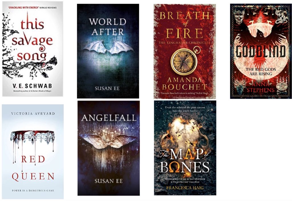
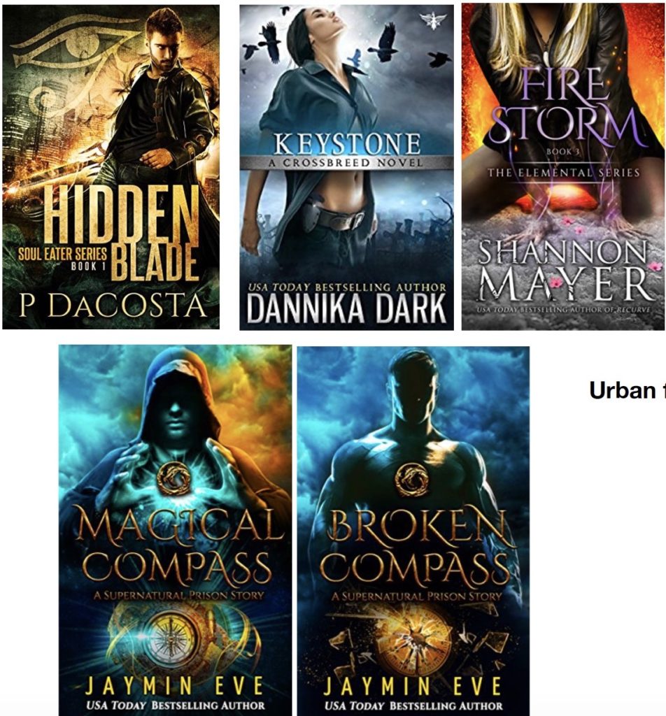
First of all, I sent over the dark fantasy elements above, examples of covers with a strong female protagonist and urban fantasy niche feel that I liked.
But I was also oscillating in terms of the genre.
So I also sent over some more elemental covers, some of the books I've read with the same feeling of fantasy, where they're used individual elements on the book cover instead of a person. I really couldn't decide which one I wanted, because I'm still getting to know the series.
You can see, from the elements that I gave to Jane that I wasn't really clear but did give some direction.
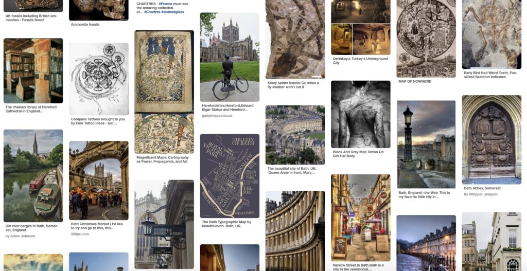
When I write, I collect images on Pinterest.com/jfpenn. So I sent Jane my Pinterest board with more images to consider, and also an image of a compass and a map.
Those were elements that were very important, it's called, Map of Shadows and it's the Mapwalker series. And the magical element is that my characters can walk through maps, which is cool.
4. Your designer's first ideas
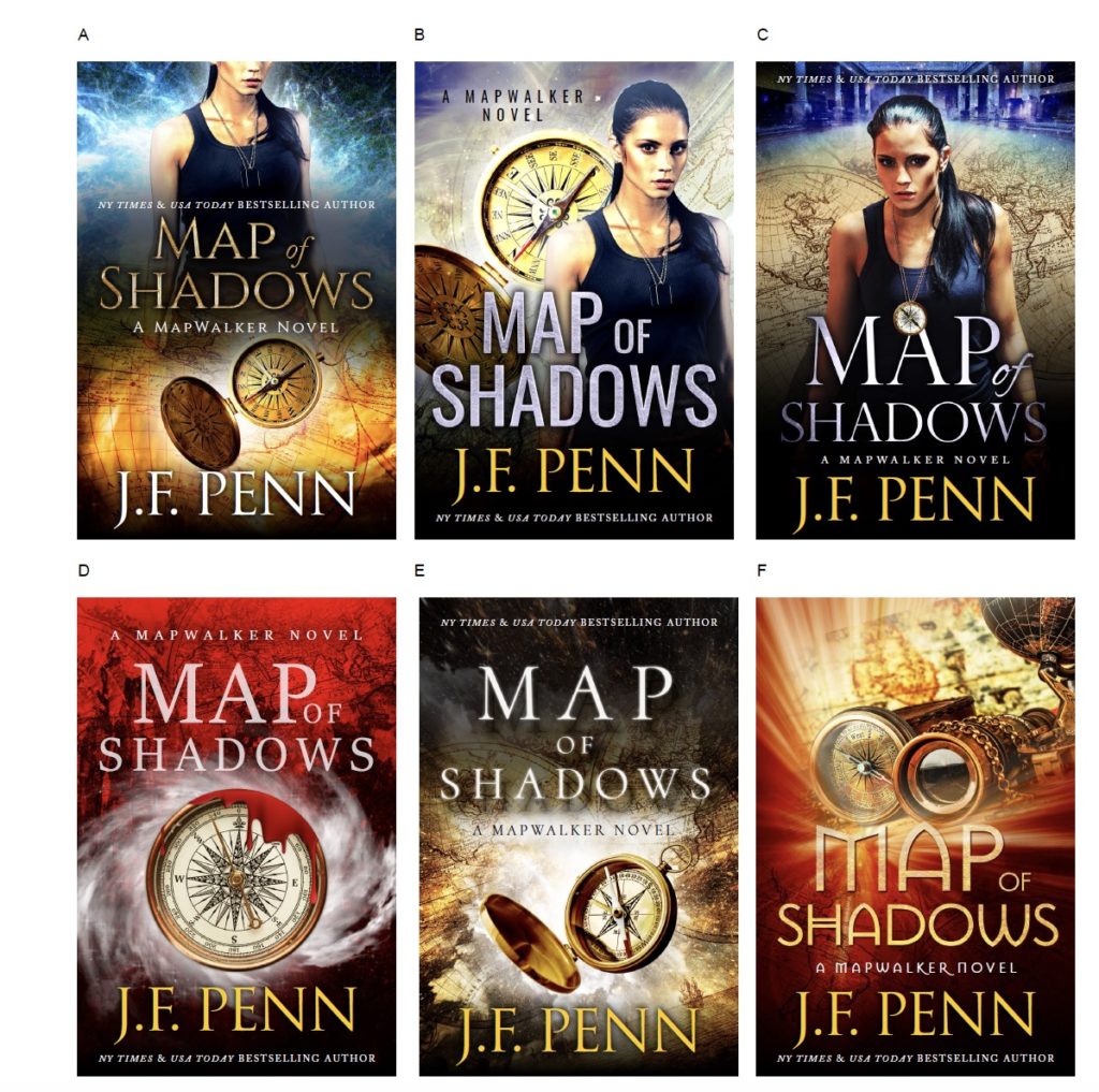
Your designer is going to come back with a number of iterations of cover design for you. Here are some of the ideas that Jane came back to me with.
They are a combination of the elements that I'd asked for in these two quite different design styles. One with a female protagonist, and the other with more of a single element. They also have a mix of fonts.
Again, this is a new series, so we might be using a different font for this series than we are for the other ones. This is where it can be very difficult because often, we don't yet know what we want.
It's very important to respect the designer and their knowledge of design elements instead of forcing yourself onto them because they often will know a lot better than you. An idea you might have in your mind might not actually match the good design elements of your genre.
5. Giving feedback
I suggest that the feedback is not, “Start again.” Make your feedback specific.
For example, I like the font of B, but I like the map of E. I like this element of that or make that color darker, change the font to this, or the font needs to be more shaped.
Go back with very specific feedback on different elements of the design.
6. Get feedback from your audience
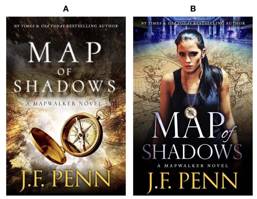
I decided there were two covers that I actually liked, but I really didn't know which one I preferred. So I decided to ask my audience.
If you do already have an audience or even just people on Twitter or people on Facebook you could ask this is a good place to go for help. This is the image that I put up on social media, which has two quite different images. And then I asked people to vote A or B.
Now, again, these are pretty different covers. The first one does have that element or aspect and could be a much more broader fantasy book. And B, with the female protagonist is very much fitting within a certain genre in urban fantasy. So I put them out there.
I got a very mixed reaction. But the people who read my J.F. Penn books really came back on A with the map and the compass because my books often tend to be a cross-genre and that's the one they resonated with.
But that wasn't enough because I felt that although I really liked A, it didn't quite have enough supernatural elements. This book clearly has a magic system, but this cover looked a bit too historical. Also, I preferred the font on the second one.
So I went back, and this is the second round of iteration that I got from Jane.
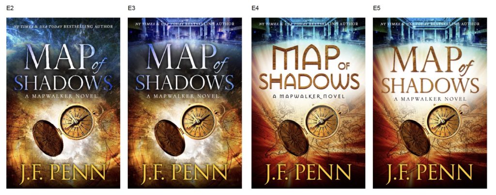
But you can see that we went through quite an iterative process to get there. So working with this number of iterations, this was two major iterations, it's completely normal. But that's why you need to discuss with the designer upfront what the expectations are on both sides.
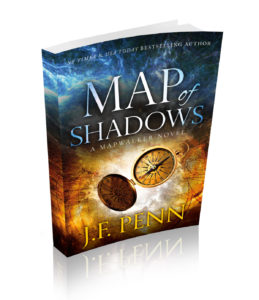
I am fortunate that Jane and I work together really well. And, in fact, sometimes she just reads my mind and does a perfect cover first time that matches exactly what was in my head. So that's amazing and that's developed over time. But that's why you have to respect the designer.
I've heard of nightmare situations where clients have just said, “No, no, no, no, no,” and never been happy. And they've changed their specifications later in the process.
Working in a series
Another thing to consider is will this be a series of books? You can often get a designer to design a series look, and then the subsequent books may be cheaper or at least the process will be quicker and easier.
Now that Jane and I have done that once for Map of Shadows, the next book in the series will have a similar look and feel, and the same fonts. We won't have to go through such an iterative process.
We did the same for Penny Appleton, with the author name in same clear font and the design elements of the English village, the happy couple, exactly the same on every book. All we have to do is switch out the different images.
And I have the same for my non-fiction. The different single element, the same fonts. And that is the same across all of my non-fiction books, and Jane did those as well.
You can also get the font name and the color palette so that you can use the same images, the same colors, the same fonts across your website and your social media. It's really good to get the whole package designed.
You will see authors who have book covers that are all over the place. Often, that's when they move to different publishers.
But if you are in control of your covers, then why wouldn't you have a very clear author brand per author name? I think I do across J.F. Penn, Joanna Penn, and Penny Appleton, and Jane has really been instrumental in making a very clear branding for each author name.
Other design images
I also get my Facebook ads done at the same time. Here's an example of, Map of Shadows.

I generally get my e-book cover done first and my print book cover made later because you need the spine size. And you can only do the spine size once you know how many pages are in the book. So you have to finish the book before you can do the print design.
Of course, you can get different types of covers for ebook vs. print book. For example, the pull-quotes or blurbs from other authors often don't look very good on a thumbnail size image. They are very small on a black and white image on a Kindle Paperwhite or even on an iPad.
In a print book, the cover pull-quote will look pretty good, or there can be stickers or other things.
You can design differently for print and for ebook. Audiobook will be different again because it's square. You might need to work with the same designer for multiple different types of covers.
Changing covers
And then, finally, what about changing covers?
Maybe you're reading this and you're going, “Oh dear, I need to re-brand my covers,” or maybe they're just old.
Many of us have been writing for a long time and we all need to update our covers eventually. I'm constantly looking at my covers, considering how they could be better.
My first three novels originally had different titles. These are the original three; Pentecost, Prophecy, and, Exodus.
I have a Master's Degree in Theology and I grew up reading Christian fiction with demons and things flying around, Frank Peretti and authors like that. I write religious conspiracy thrillers described as ‘Dan Brown meets Lara Croft.' And my original titles and covers very much resonated with the Christian fiction market.
But actually, these books are not Christian fiction. When I realized after writing a number of them that they were actually action-adventure thrillers – conspiracy thrillers based on aspects of Theology – but more Dan Brown action-adventure than anything else.
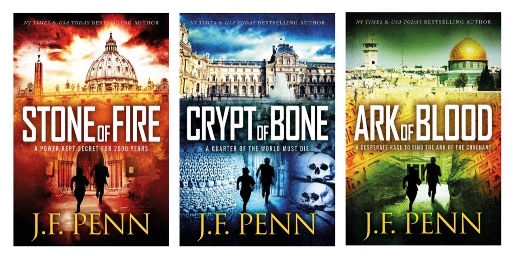
The new covers, Stone of Fire, Crypt of Bone, Ark of Blood, are very different from the original covers. They are the same books, just with different covers, different branding, very much more colorful and alive.
They resonate with the genre of action-adventure thriller. You can see the running people demonstrating a ticking clock to save the world type of story.
Desecration, the first of my Brooke and Daniel Psychological/Crime Thriller trilogy, went through several iterations of covers.
Now, this is probably my most cross-genre series in that I had meant to write a British detective, female-protagonist crime novel with nothing supernatural in it, but inevitably, a supernatural element crept in. I just can't help it!
The first book, Desecration, has a theme of human anatomy. So you can see the beautiful design there by Derek Murphy, he did many of my earlier books. It's a beautiful design and I still love it. I still have a few of those special editions.
Then, as I started to discover what the series actually was, I realized that it needed to be a dark cover to resonate with my brand. The white background was my non-fiction brand, not my fiction brand. So we went with the darker cover with the woman with the gun.
Then I decided that the gun wasn't necessary and I should get rid of that. Jane did another design with the woman in London. We redid the trilogy in 2020 to simplify the books entirely.
So don't worry.
If you are in control of the publishing process, you can update your covers later.
You don't need to do new ISBNs or anything when you're just changing the cover. You can just upload a new file and it will be out there which is very exciting.
So I hope that has been helpful for understanding how the book cover design process works.
Click here for recommended book cover designers.
Need more help?
If you'd like some more help on your author journey, check out:
- Free Author 2.0 Blueprint ebook and email series
- My Books for Authors
- The Creative Penn Podcast, interviews, inspiration and information on writing, publishing, book marketing and creative entrepreneurship every Monday
- My videos at YouTube.com/thecreativepenn

 3. Share design elements