Readers DO judge a book by its cover, and you only have a split second to make a reader want to click to read more or download a sample.
In my opinion and experience, the two most important things to invest in as an indie author are professional editing and professional cover design, and finding the right designer to work with is an essential part of any author business.
In today's article, book cover designer Jessica Bell walks us through what we need to know when we're choosing a book cover designer.
Know What You Want & Need Before Hiring a Cover Designer
If you’ve decided to outsource the cover design of your book, there are some very important things you need to consider before you shake the hand of your service provider. Today I’m going to talk about what information you’re likely going to have to provide in order to brief a cover designer, but before I do, I’d also like to explain, what I believe to be the fundamentals of book cover design. This information will help you get the most out of your vision, assist in facilitating a smooth author/designer working relationship, and result in a quality product (your book!) that your audience will want to buy and read.
The four most important design factors I live by are:
1. Subtle color combinations.
But if you’re after bold and vibrant colors, please don’t use too many. It hurts the eyes. And sometimes scares readers away. I have often found that the most attractive covers I’ve ever seen use a maximum of three different colors and include black, white, or grey.
2. Less is more.
If there are too many elements in a cover, readers aren’t going to know what to focus on. And if they don’t know what to focus on, they are just going to skim past it. Think of the days when we used to use a corkboard. All those bills, and reminders, and notices, all piled on top of each other, pins sticking into multiple pieces of paper. You could not see everything that was on that corkboard. And most of the time you didn’t even try to. Don’t scare your potential readers away by trying to fit too much in such a small space.
Notice how the first one has tried to incorporate too many elements and it looks a cluttered mess (not to mention the highly ambitious color scheme.) And notice how the second one has a lot of space. There is room for the image and text to breathe and it therefore draws the eye.
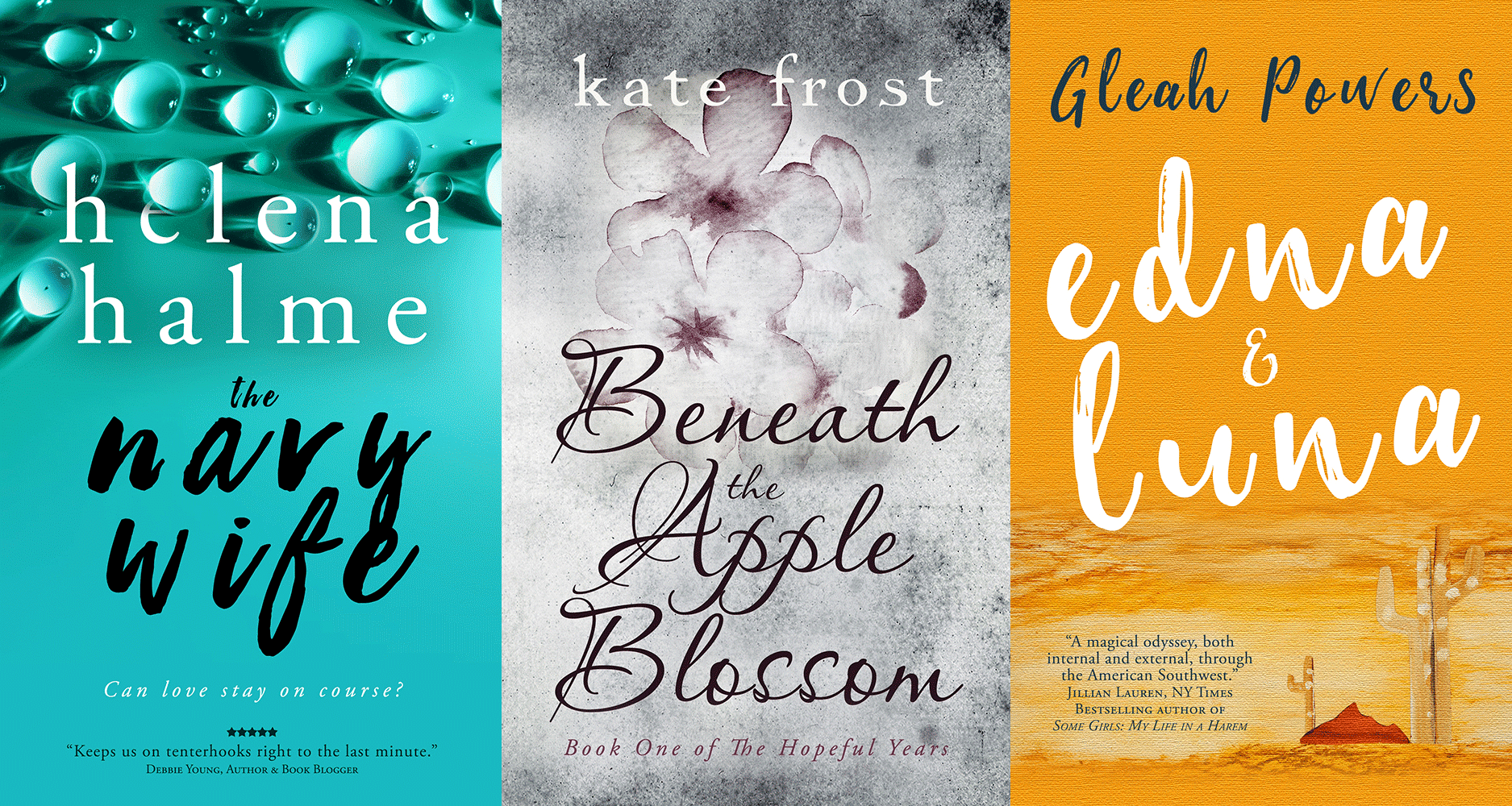
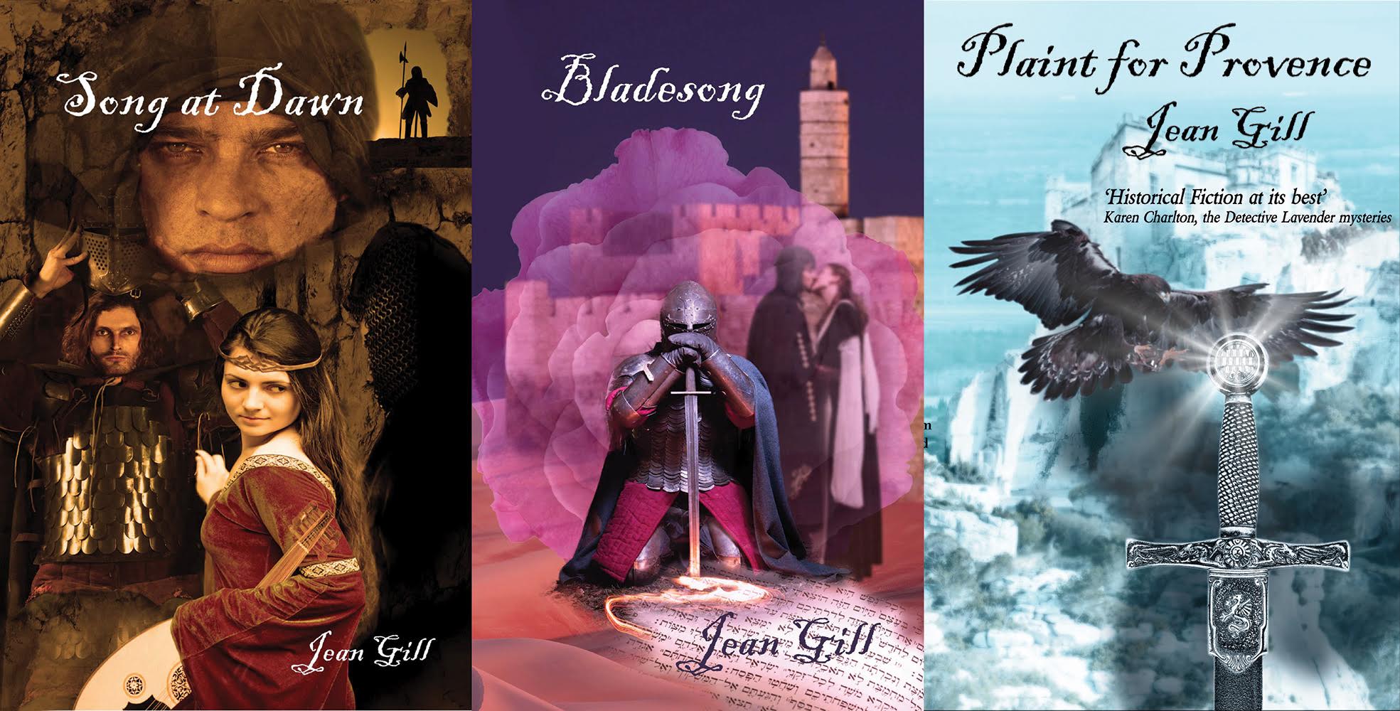
3. Focus on portraying a particular theme or emotion.
People are attracted to visuals because of the way they make them feel. Which is why you often see TV commercials implementing a narrative that doesn’t seem to have a direct relationship with product.
For example, while I was visiting family in Australia not long ago, I saw an advert that captured my attention. The narrative shifted from scenes in various homes with happy and relaxed families and individuals. Cooking, reading, playing with a baby, a writer content at his desk, etc. All the people in this advert were smiling and at complete ease. In a literal sense, it looked like it was an advertisement for either a furniture store, or a real estate agent. There was no text, until the end, when a bank’s name popped up, along with something very simple about their new easy Internet banking system. What was their message here? Bank with us and you’ll be able to enjoy life completely stress free.
Notice how the covers on the right do not try to tell a story, but rather project a tone.
4. Be careful with your choice of font.
Don’t go overboard with cursive fonts. Sometimes you may be able to find a suitable cursive font that looks excellent. Other times you may be better off finding something that is more ‘classic’. To know what looks good against the backdrop of your cover, however, takes a little bit of trial and error. Don’t be afraid to experiment and compare. Another thing to consider regarding font choice, is that certain fonts mesh well with certain genres.
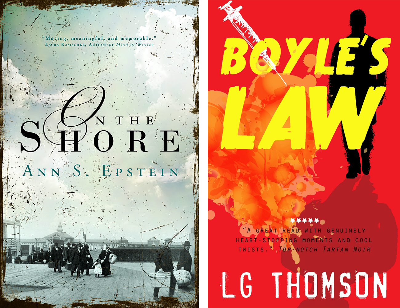
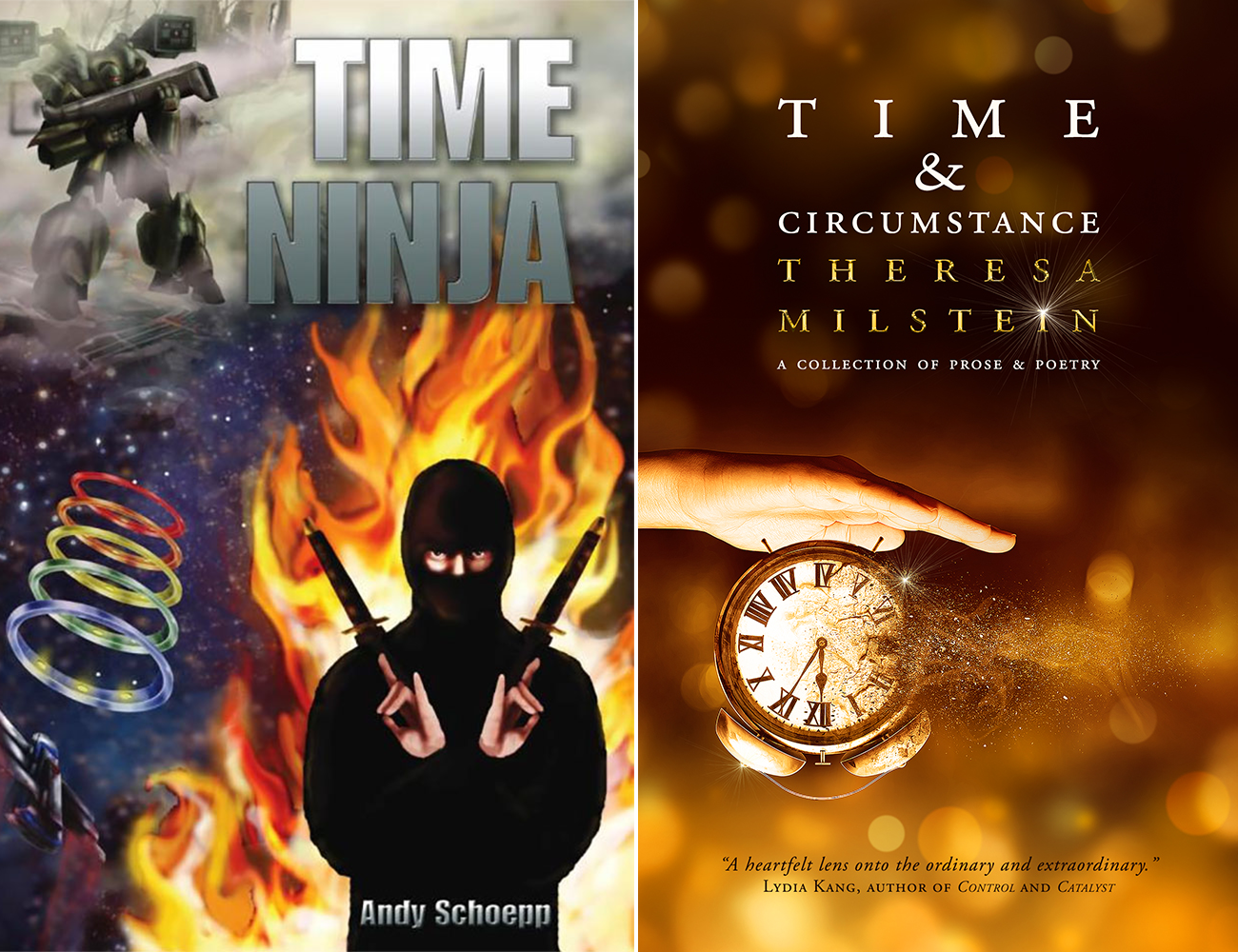
Now try your hand at a little comparative analysis:
Take a look at the following two sets of covers. These are for the same books. Which set of covers do you prefer and why?
Think about the following aspects:
1. What do you like/dislike about the designs?
2. What genre do you think they represent?
3. What time period do you think the books are set?
4. Are the colors appealing?
5. Do you think the positioning of the various elements is aesthetically pleasing to the eye?
6. What do you think of the fonts used? Do you think they are suitable? Why/Why not?
7. Does the cover make you want to take a look at the blurb? Why/why not?
Please keep in mind there are no right and wrong answers here. They are all open to personal taste and interpretation.
On hiring a freelancer to design your book cover:
If you’re keen on hiring a freelance cover designer, take a look at the following questions. As your cover designer will most likely not read your book, answering these questions will help him or her create the best possible cover for you. It will also assist you in honing in on your own vision, spark a few revision ideas, and/or inspire you to think about marketing angles.
a. What is the genre of your book?
b. Who is your target audience?
c. What year is your book set in? What aspects of this era is prominent in your story?
d. What is the setting like? Describe it to the best of your ability. (You may wish to include an excerpt from your book where it is described, too.)
e. Are the protagonists male or female, and what is his/her age and what does he/she look like? (eye color, hair color/length/shape, any defining marks like scars or tattoos, etc)
f. What kind of relationship do your protagonists have? Romantic, just friends, siblings, etc. (This is important because you do not want your designer having the protagonists French kissing on your cover if they are siblings.)
g. What are the themes in your book?
h. Do you use any reoccurring symbols in your book? (For example, in one of my books, I use a wilting orange tree to symbolize a gradual breakdown of familial warmth.)
i. What do you want shoppers to feel when they see your covers?
j. What is your vision for the cover? (Most designers will attempt to incorporate an author’s vision, but they don’t always work, so try not to be married to your ideas. Rather, consider your vision and ideas as inspiration for the designer.)
A few last words:
Think about having your eBook cover designed before you send your manuscript for typesetting.
This way you’re able to match the fonts you use for your chapter titles and/or section headings, with the fonts used on the cover. Matching the look of the interior with the cover will ensure you have a professional-looking and cohesive overall design. Then once typesetting is done, you can move onto the paperback cover. (The designer needs to know the page count in order to determine the width of the spine.)
Remember that a book cover designer is always going to do what’s best for your book.
Their reputation is on the line as a designer, as must as yours is an author. So try to go into the collaboration with the understanding that you may not get exactly what you had in mind (especially if they use stock photos), and keep an open mind. You never know, you might end up with a cover 100 times better than you envisioned if you give your designer some creative control. I know that I’ve designed my best covers when the author offered me lots of suggestions and zero limitations.
Also, make sure you take a good look at the designer’s portfolio before you hire them. If you love their work, you’re bound to be compatible.
Do you have any questions about book cover design or hiring a designer? Please leave them below and join the conversation.
Very soon after her design debut, she started designing covers for author friends as a favor. Until one of her friends told her that she should start a business. She took their advice, and since then she has designed hundreds of covers for indie, traditional, and hybrid authors, many of which have hit bestseller lists, and won awards.
Being an author herself, she fully understands the need to be able to incorporate an author’s vision into their book cover and is sensitive to their needs. She also prides herself on prompt friendly service and an iterative design process.
Learn more at: bit.ly/jbbookcovers
Save
Save
Save
View Comments (3)
Keeping an open mind when working with a cover designer is excellent advice. When I had my first ever cover designed for book 1 in The Englishman series, I had a very definite idea of what I wanted. I even insisted it had to have a picture of my Englishman in his white tropical uniform, standing on the deck of a Royal Navy frigate. (The story is based on my own life). Whilst I still love the cover, it quickly transpired that the image of my navy officer meant something solely to me, but stirred little emotion in others. Now with designs by Jessica, all the books (including The Navy Wife above) have themed covers, which convey emotion, rather than give definite images of the words inside the covers. Using the same font and style, Jessica has cleverly made the whole series look the same, yet different. Thank you Jessica!
Aw thanks, Helena!
Excellent Joanna - so happy you've met your challenges this year. So cool that you focused on health. I'm impressed with your business' success and believe that when a couple works together great things happen. Good luck to your team this year.