OLD POST ALERT! This is an older post and although you might find some useful tips, any technical or publishing information is likely to be out of date. Please click on Start Here on the menu bar above to find links to my most useful articles, videos and podcast. Thanks and happy writing! – Joanna Penn
My thriller novel ‘Pentecost' is back from my editor and I am in rewrite mode. I am putting together my marketing plan and am currently just over 3 months away from launch (expected to be Feb 1st 2011). I will soon be putting together the back blurb and letting you read a few chapters, but to start the marketing in earnest I need to get my front cover sorted.
In the last few weeks, I have been working together with Joel Friedlander, The Book Designer who has put together some fantastic options for my book cover.
I have included a number of iterations in this blog post for you to see and also to vote on in the survey at the bottom of the post. I am deliberately holding back detail of the book's plot as I want you to make a decision based on the cover.
Is this a book you would like to read? Does the cover attract you or turn you off? Which cover makes you want to buy the book? (If none of them, do you have any suggestions?) Please add your preferred cover number in the survey at the bottom of the page and any suggestions in the comments of this post.
The process for any kind of design is iterative so it is important to remember when you get the first lot of images that they are not the final options. I sent Joel a draft of the novel so he could get some ideas, and he had a first pass at cover options giving me 9 different covers to comment on. I sent back comments on colors I liked, wording, fonts, images and Joel went round again. We did this several more times and narrowed down the options I specifically liked.
Some of the aspects I particularly wanted to include were:
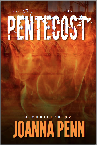
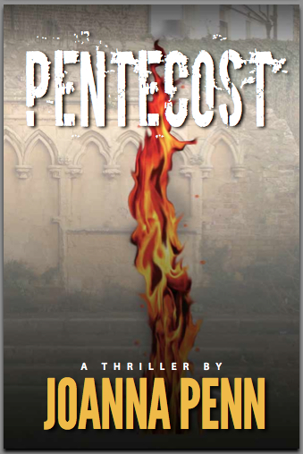
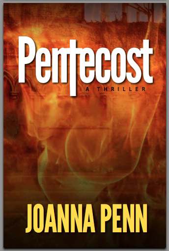
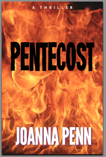
- Fire and flames, given that the book is called ‘Pentecost' and fire is an overall theme
- The words ‘a novel' or ‘a thriller' as I have noticed that the bestselling books are doing this now
- A cover that is clear when sized as a thumbnail
- My name clearly displayed as I am building a brand. It doesn't matter so much now, but in a few years time it could be more important. One of my favorite authors Matthew Reilly did this when he got started, and now he is huge in the action/adventure/thriller genre.
It's good to have some of these ideas in mind when you work with a designer, but also be open to their thoughts as well since it is their job to come up with new images.
Joel has some more great tips for book cover design here including:
- Establish a principal focus for the cover, and stay with a few images. Don't clutter.
- Avoid white backgrounds and make the text stand out with a title font that is easy to read
- Have a look around at other book covers from novels/books in your genre to see what they are doing
Pentecost was re-edited and re-published as Stone of Fire in 2015.
View Comments (145)
-
-
-
-
-
-
-
-
-
-
-
-
-
-
-
-
-
1 2 3 … 11 Next »I voted Option 2 but Option 1 would be a close second.
I also voted Option 2, but I think Option 4 would be my second choice. Why does Joel say to avoid white backgrounds?
Joel says to avoid white backgrounds as they don't show up well on Amazon.com as thumbnails. I can attest to this having made this mistake!
http://www.amazon.com/Idea-Book-Writing-publishing-ebook/dp/B00243GPA0/ref=sr_1_1?ie=UTF8&m=A24IB90LPZJ0BS&s=books&qid=1288129456&sr=8-1
However, it does make it really easy to do print :)
I also voted for two for it's visual interest, but found it sort of hard to read by the lack of contrast when smaller.
Nothing against your cover designer (I just really like to play around in photoshop) I've created two others:
http://twitpic.com/30yomu and http://twitpic.com/30you4
All the best,
Cassandra
Hi Cassandra - wow, those are great! Are you a designer yourself? I particularly like the first one. I've subscribed to your blog so I can what else you are up to. Thanks so much for playing around with ideas for me!
No, I'm not a designer. I've toyed with doing some freelance work, but I don't know much about cover art creation yet and it would take some significant research on my part before I even attempted to create a real one. All that rights stuff and sizes/quality... I'd need some training. :)
Thanks for following me back! I hope I can be useful or at least a bit of sunshine for you!
Cassandra
1, 2, and 3 are all good and each has positives. I prefer the more artistic font for the title, though.
I voted for 1 but 2 is a contender. We don't think of fire as being a ribbon from the sky yet that is the image we have in Acts. It works and makes your book stand out from all the other flames-on-the-cover books.
Neither particularly stands out. Absolutely NOT 4. The black text, font choice, and roaring flames suggest evil. (Unless that's what you're going for.)
Thanks Daniel - I appreciate your point of view. There is definitely a good vs evil struggle in the book in the characters - like any thriller I guess, there has to be high stakes! Thanks.
I voted Option 2, but Option 4 is also an excellent cover. I like Option 2 because the Architecture in the background, to me, hints at intrigue in the story. I can tell you if my brother was voting he'd vote for 4 though - he's a total pyro and that's the best pyro cover!
Thanks Ruthie. There is architecture hiding behind the flames in Option 1 but it doesn't come across so well in the thumbnail size image. The book's antagonist is a bit of a pyro as you may have guessed!
I voted for #1 :-) Did you ever consider going the traditional route?
Hi Livia, Thanks for your vote. On the publishing thing, I am not willing to approach publishers with a first novel in a new thriller series without evidence of sales and platform. I have also been listening to JA Konrath and also Dan Sawyer's last post on ebook publishing. I also want to enter the book into Amazon Breakthrough Novel Award but you can do that with a self published book.
So, the plan is to enter into ABNA end Jan, self-pub in Feb 2011, see what happens re sales, start writing the next book in the series and also go to Thriller Fest in NYC in July and meet some agents and publishers then. Who knows what will happen but I want to have something to offer publishers other than just a manuscript. A bit Boyd Morrison's "The Ark" which publishers picked up after successful ebook sales.
I'm all for adventures in all kinds of publishing!
I voted for #1, but #2 would definitely be my second choice.
I voted for Option 1. I think the lettering against the background is striking. Would certainly grab my attention in a book store.
Option 2 grabbed me first but since you're publishing a thriller, I voted for Option 1, which looks more thriller-like. I really like this blog and what a great way to engage people before your book is even released. I'll be looking for Pentecost when it comes out.
Thanks Joanne - you spotted the marketing tactics with this post as well! I will be doing a number of posts over time up to the actual launch so people get familiar with the book and the title, and also so other authors can learn from the mistakes I make (and hopefully the good things too!)
I voted for option 3, for these reasons
1) the font used on the title is clearer, easier to read than the other three options, even at smaller sizes (I increased my resolution to see how it would look much smaller than above);
2) Your name is easier to read due to the darker background behind the yellow lettering, better than options 1 and 4;
3) The flames are still recognizable, even at smaller sizes, better than option 2.
Good luck with choosing!