Your book cover is one of the most important aspects of marketing your book. If the cover isn't enticing or doesn't resonate with your genre, no amount of marketing will help sell your book.
I absolutely recommend that you use a professional for your cover design in order to make it the most effective for your book. As an author, you don't have all the skills needed to create a great book and this is one area worth spending on. (Professional editing is the other one!)
Here's my video and article on how to find and work with a book cover designer
Book Cover Designers
[Please note: I am an affiliate of some of the services below because they are excellent quality and have been recommended by other authors. If you use my link, I will receive a small percentage of the sale at no extra cost to you. Thanks for checking them out!]

Reedsy has a marketplace of vetted professional book cover designers with experience in every genre. Click here to check out their options. They also have editors and marketing professionals.
Author Packages – ebook and print book cover design, plus formatting services
Ebook Launch Cover Design: Beautiful cover designs for ebook and print
More book cover designers
JD Smith Design: Jane is my current designer as well as doing my interior formatting.
Damonza – Books made awesome, specialist book cover designs for bestselling books.
GoOnWrite – James does book cover commissions and has pre-made covers available.
Jessica Bell Design – Book cover design services for indie authors, email support and iterative design. Discount for members of the Alliance of Independent Authors.
INeedABookCover — Book cover design directory
17 Studio Book Design: A great selection of reasonably priced pre-made covers as well as design packages for covers and ads.
Jeff Brown Graphics: Book cover designer and illustrator specializing in sci-fi and fantasy. Currently offering $200 off if you come from The Creative Penn.
Derek Murphy at Creativindie Book Covers : Derek did some of my earlier covers – Desecration, Delirium, A Thousand Fiendish Angels & my non-fiction books Career Change and the original How To Market A Book. He doesn't do much design work these days, but he has also written this article on How to create your own book cover in MS Word which can help if you're cash-strapped.
Books Covered. Design agency creating market-leading book cover design.
Carl Graves at ExtendedImagery.com : Although I don't know Carl personally, he does Joe Konrath's covers and also has some sales on ready-made covers now and then which is a great idea to keep costs down.
Cover Design Studio: Need cover design on a budget? Customize template book covers for your books.
Robin Ludwig Design: Robin does book design for some friends of mine so I can recommend her services.
Bookfly Design: Ebook and print covers. Recommended by one of my community.
Mars Dorian does ebook covers that stand out for $150-$200
Dane Low at Ebook Launch does ebook cover design for $99 – $279 and is #1 on Smashwords recommended designer list
The Book Cover Whisperer -“Big 5” book cover design and book marketing. Design ethos: visually stunning covers and promotional products your readers will love. Researched, quality production. Unlimited changes until you’re 100% satisfied. IBPA member. Listed on IngramSpark Publishing experts page.
Syd Gill – graphic design and book covers
Alexandra Brandt – Cover design (and more) for all flavors of sci-fi and fantasy.
BEAUTeBOOK – Includes ready-to-go and custom covers
Book Design by Ana – including urgent designs and budget options
Karrie Ross Book Cover Designer – print, ebook plus interior design
Streetlight Graphics – cover design, formatting and typesetting, print media and other art
I do book covers – includes tips for indie authors
Covertopia – bestselling predesigned covers
Best cheap book covers – beautiful covers for independent authors
Hazel Lau at Kindle Station
Audria Wooster at Design by Indigo. Over 20 years' experience.
Candescent Press. Recommended by a student of mine. Design and formatting.
Junriel Boquecosa, Graphic Design
Epicenter Creative Branding by Design
Eden Graphics, Book Covers and more
Kingwood Creations, Affordable pre-made book covers
DesignOnClick.com Book cover design and more
Amber Razzouk Book cover design and more
WordSugar Designs. Professional graphic design for authors by an author
The Book Cover Designer The largest selection of pre-made book covers online.
Brandi McCann, Book Cover Designer
Sanja Gombar Book Cover Design For You
Burak Ulker Book cover examples here.
Hudson Valley Book Design Ebook and Print covers
Elena Dudina Book and CD cover design
dePinho Design Small but mighty graphic studio with a nose for design
Sam Wall Book cover design and art work
Van Garde Imagery Book interior and cover design
Dissect Design Bespoke book covers
Nico Illustration and Book Cover Design
MoreVisual Award-winning book cover design
Laura Duffy Book Cover Design & Graphic Design
River Book Cover Design Fiction and Non-fiction
MiblArt Custom book cover design.
Working Type Studio, Book Cover Design and Layout Solutions, and Print Design Services
Lance Buckley Design Print, Publishing, Branding
I Love My Cover Independent book design and marketing
Clarity Book Cover Design Book covers, social media banners, memes, swag.
Greg Simanson Design Book covers and more.
Historical Fiction Book Covers Jenny Quinlan specializes in book cover design for historical novels.
Jeff Brown Graphics Sci-fi and fantasy book cover design.
The Book Cover Shop Book covers that fit your book and story.
WolfSparrow Covers Premade and customer book cover design.
Vibrant Designs Book covers, ads, logos and more.
Book Cover Zone Book covers that work everywhere.
Rocket River Book cover design.
Book Beaver Eye-catching book cover design.
Mayfly Design Custom book cover design.
Bailey Designs Books Book cover design.
Hannah Linder Designs Book cover design.
Lance Buckley Design Print. Publishing. Branding.
Yummy Book Covers Custom book design. Free templates. Pre-made covers.
StoryWrappers Custom Fantasy book cover design.
Cover Rave Romance covers to rave about.
Lee Hyat Designs Inspired by color. Designed with heart.
Firewire Creative Book design for CEOs and thought leaders.
Fenix Designs Magical covers for out of this world stories.
Manuela Serra Design When your words merge into an image.
Deividas Jablonskis Noticeable book cover designs.
Complete Book Covers Professional book cover design.
TS95 Studios Book cover artist and graphic designer.
Lisa Amowitz Book cover design.
Printed Pages Studios Professional book design for entrepreneurial thought leaders.
Villa Design eBook and Book Cover Design
Secret D'Artiste Custom fantasy book cover design
Emily's World of Design Book cover design for various formats
Book Cover Studio. Custom book cover design for ebooks and print
Karolina Wudniak. Book cover design and layout.
The ebook designer. Book cover and interior design. UK based.
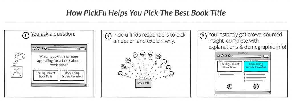
Split testing your book cover design
One of the issues with book covers is deciding which one you think will sell best. A great way to decide is to split-test them with people who don't know you or want to protect your feelings 🙂 Check out Pickfu for a quick and easy way to test.